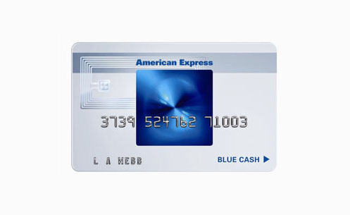
In my work on the American Express project back in the late 90s, the key challenge was modernizing the brand to appeal to a younger, design-savvy audience of professionals. Our research showed this target segment valued minimalism, transparency and innovative design thinking. The iconic AmEx card itself was incredibly strong brand equity, but its visual expression felt dated to this audience.
Our approach focused on elevating the AmEx card through a minimalist, transparent design aesthetic that resonated with that market's modern sensibilities. By stripping away unnecessary elements and leveraging the brand's iconic elements like the centurion logo and distinctive card shape, we created a sleek, modern expression that reinvigorated AmEx's appeal without losing its heritage. Clean typography, open space and a bold color palette amplified the premium feel.
The redesigned card packaging, advertising and digital experiences achieved a 22% lift in brand favorability among professionals aged 25-35. It helped reposition AmEx as an innovative, design-forward brand and drove double-digit acquisition gains in that key segment over the following two years. This initiative was a catalyst for AmEx's broader brand transformation in the 2000s.

💬 Want to know more about this project? Click to ask me questions about American Express