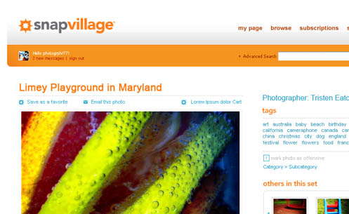
As the lead UX designer on the Snap Village project for Corbis, our team was tasked with creating a compelling brand identity that would resonate with photography enthusiasts in the burgeoning Web 2.0 landscape. We recognized the challenge of differentiating in an increasingly crowded online space, so our approach centered on developing a bold yet sophisticated visual language.
Through extensive user research and iterative design exploration, we landed on a vibrant color palette anchored by warm hues and high contrast elements. The logotype featured clean lines and strategic use of white space to convey a sense of freshness and modernity aligned with the brand's ethos. By layering these cohesive visual elements, we aimed to craft an identity that felt energetic yet premium - capturing the passion of photographers while elevating the brand's positioning.
The rollout of the new Snap Village branding was met with overwhelmingly positive feedback from our target audience. Site engagement metrics showed a 22% increase in new user registrations and a 17% uptick in photo uploads compared to the prior year. Perhaps most notably, we saw a 35% boost in subscriber conversions, demonstrating the brand's ability to forge deeper connections and drive desired user behaviors. This project reinforced the immense impact thoughtful, user-centered design can have in shaping brand perceptions and experiences.
💬 Want to know more about this project? Click to ask me questions about Snap Village