
Snap Village
BRAND SIGNIFICANCE GET FRESH
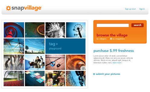
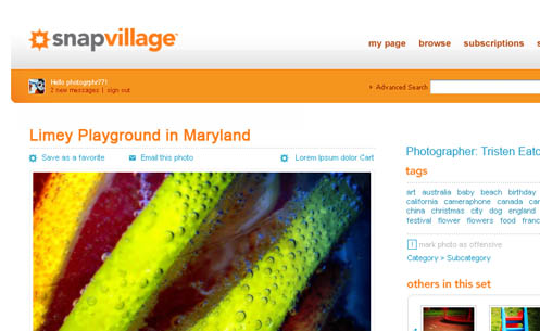
Corbis entered into the Web 2.0 space with its SnapVillage brand. Working in conjunction with another agency, PPMG created the distinctive mark that speaks directly to the core audience, photography enthusiasts. The logotype and colors were selected to provide the punch that Corbis was looking for in the brand. We used warm colors and high contrast along with a sophisticated use of white space to fulfill the brand ethos – freshness and pop.
We also consulted and provided strategic direction for interface design, user flow and information architecture.