Web Design
Amazon
UX LEAD FOR AMAZON TRADE-IN, AMAZON RENTALS, WAREHOUSE DEALS, AND LIQUIDATIONS
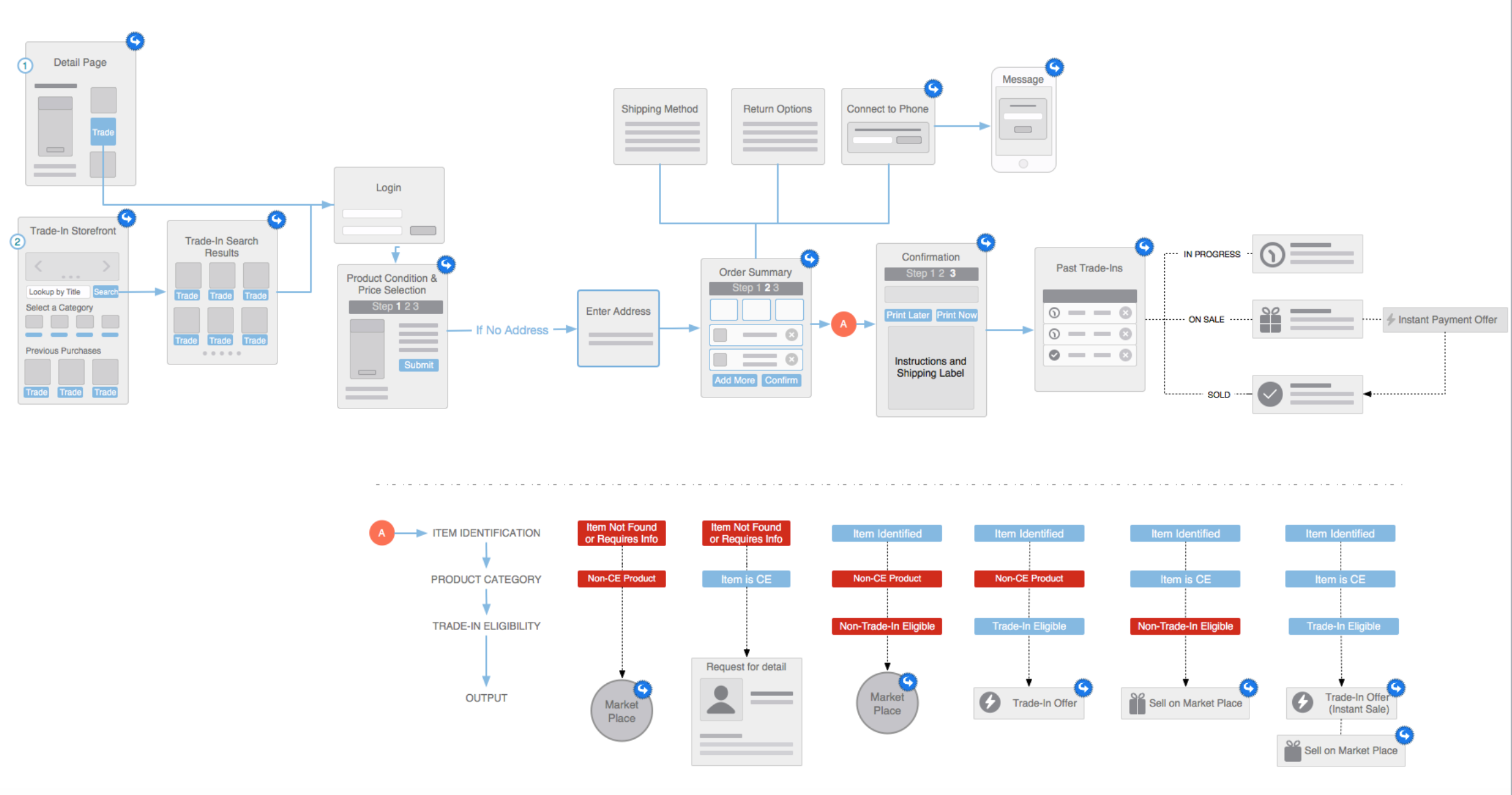
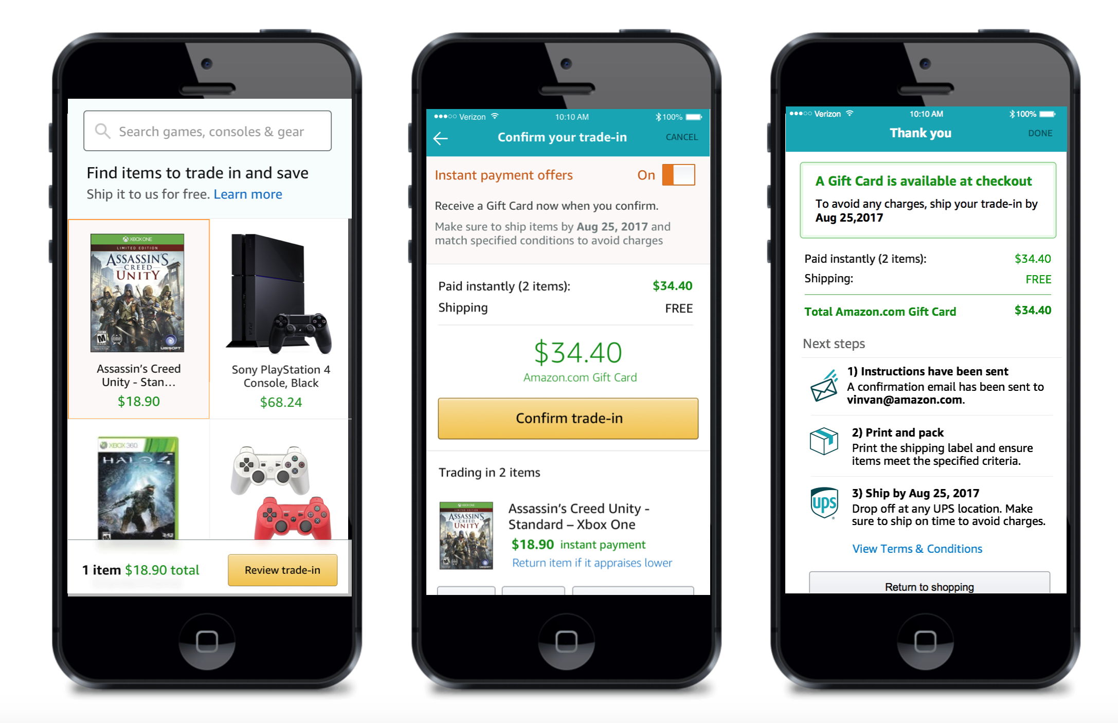
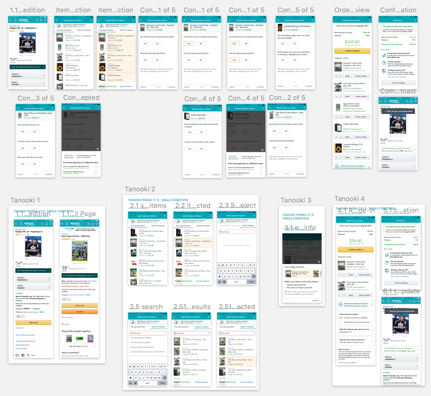
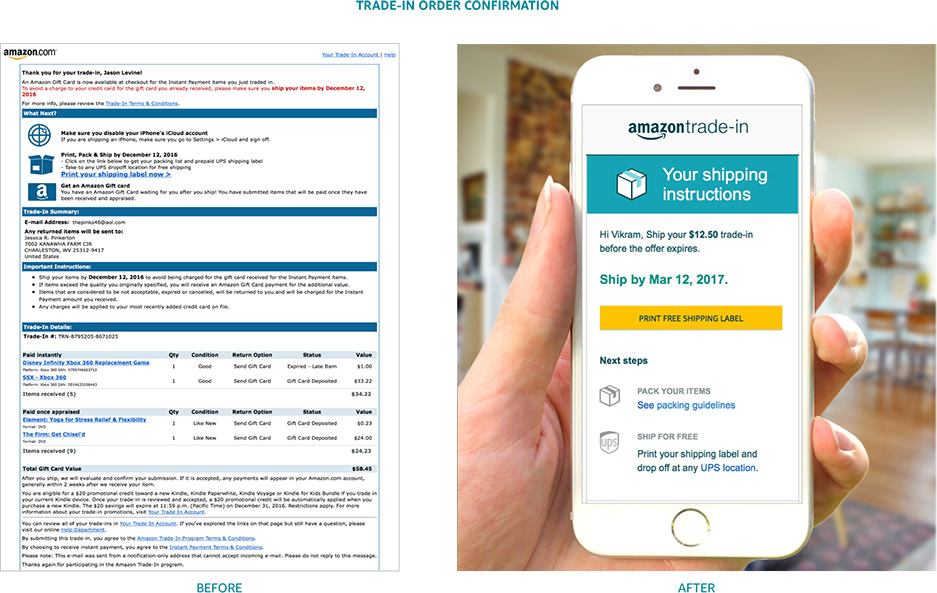
Since March 2014, I have been the UX lead for oversight of all branding, user experience, user research and visual design for four Amazon global sub-brands, totaling +$800M GMS. As a key stakeholder in all product planning and development, my role is to lead the UX strategy, team management, resource planning and oversight of all design deliverables for all customer-facing efforts on desktop.
As the UX Lead, I am responsible for knowledge management, managing work queues, crafting and pitching design strategies, driving alignment around design and product decisions, development of other designers, and partnering with peers, stakeholders, and owners across Amazon.
- Trade-In increased revenue +50%, increased submission by over 300%, grew customer base over 60%, and improved retention 15%
- Rentals market share grew 160%, and average basket per customer size by over 70% Warehouse Deals processing facilities saved $2M per year from design improvements
- Filed a pending patent March 201

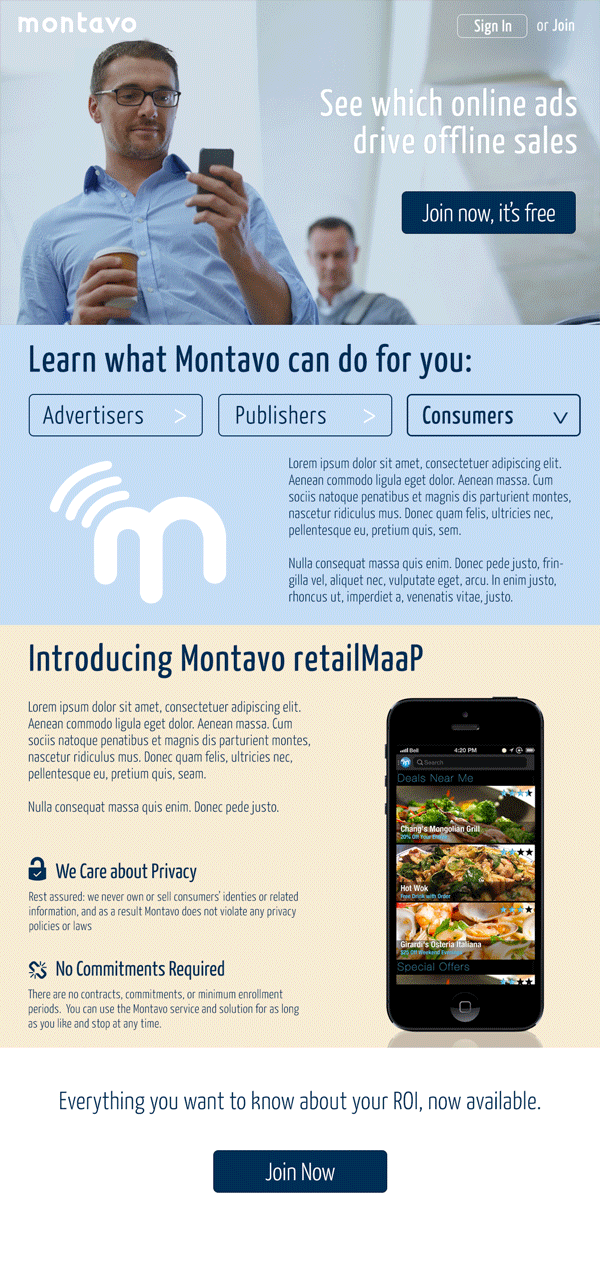
Montavo


IPHONE APPLICATION DESIGN
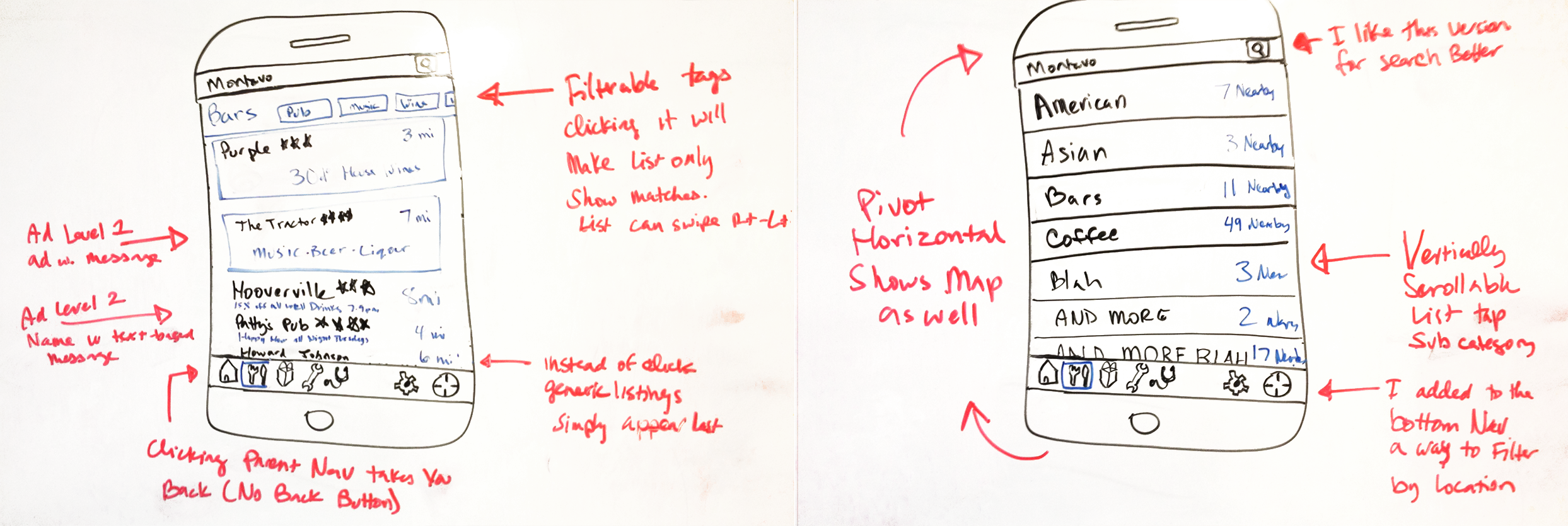
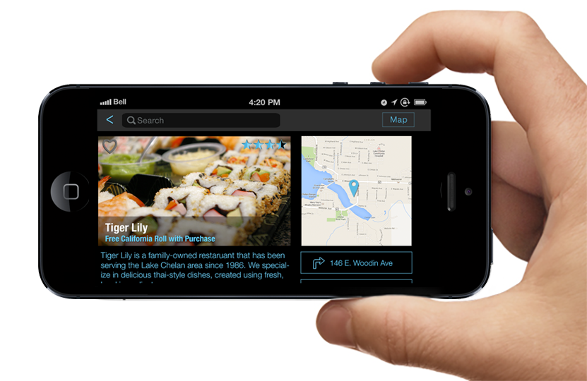
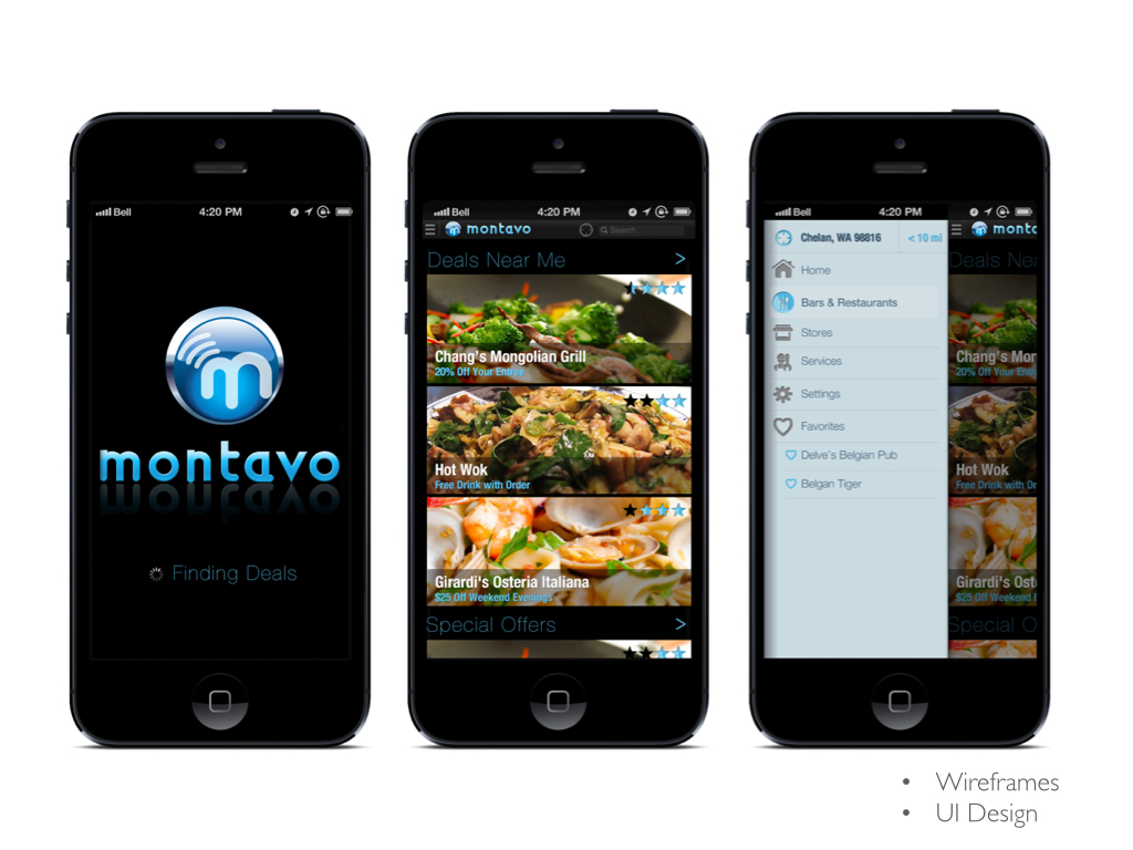
Montavo is an ad service that provides targeting and ROI data to advertisers. Part of that strategy is providing consumer phone apps. I led a team devising the mobile UI concept for a location-based offer tool. The app identifies your position and allows you to choose the nearest Bar, Hotel, Movie Theatre, Restaurant, Club and provide the best offers available for your location. Montavo’s app shows you a complete list of all the businesses in the category you have tapped on along with the distance from where you are and a special offer from that advertiser.
After working directly with the client with whiteboard sketches, we made a clickable set of wireframes to define the scope and functionality. The UI solution was to maximize the vertical space and swipe-scroll through the list. We then designs for the iPhone plus iPad in landscape to follow the new iOS7 styling.
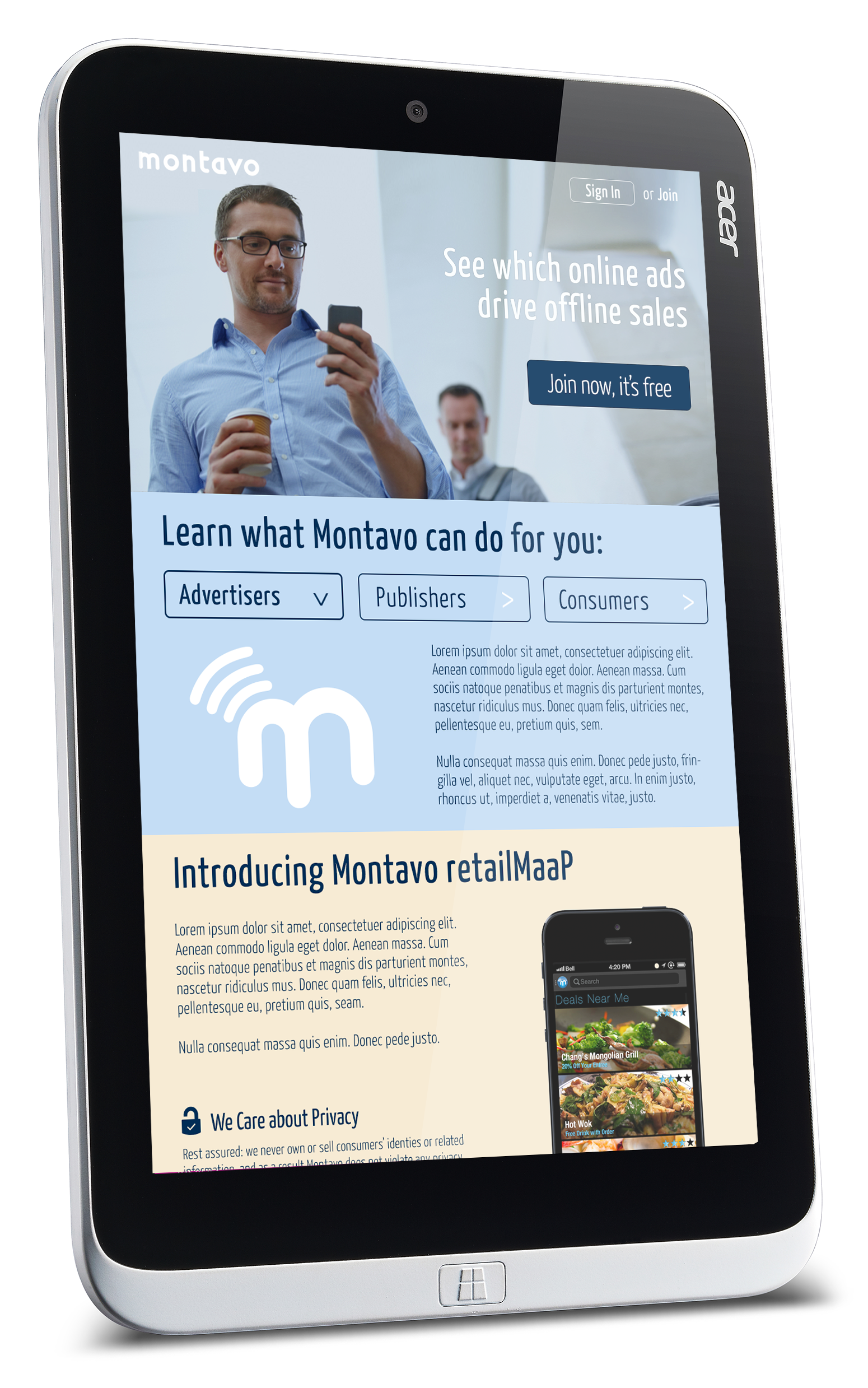
We also provided a design for the Montavo website utilizing parallax where elements slide in and out as one scrolls. The design concept was to make as simple of a solution as possible to introduce the content while reinforcing a brand aesthetic. View parallax treatment >
Stanford University
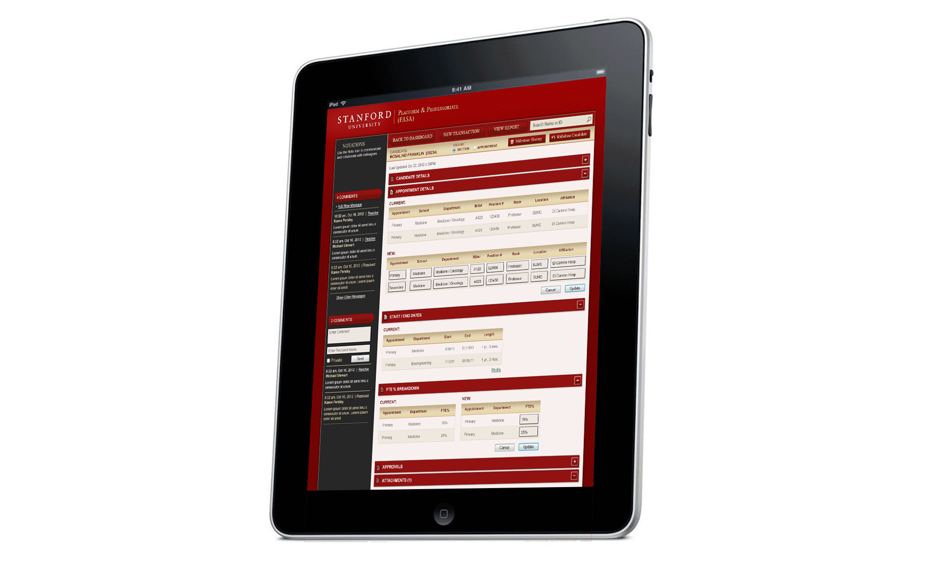
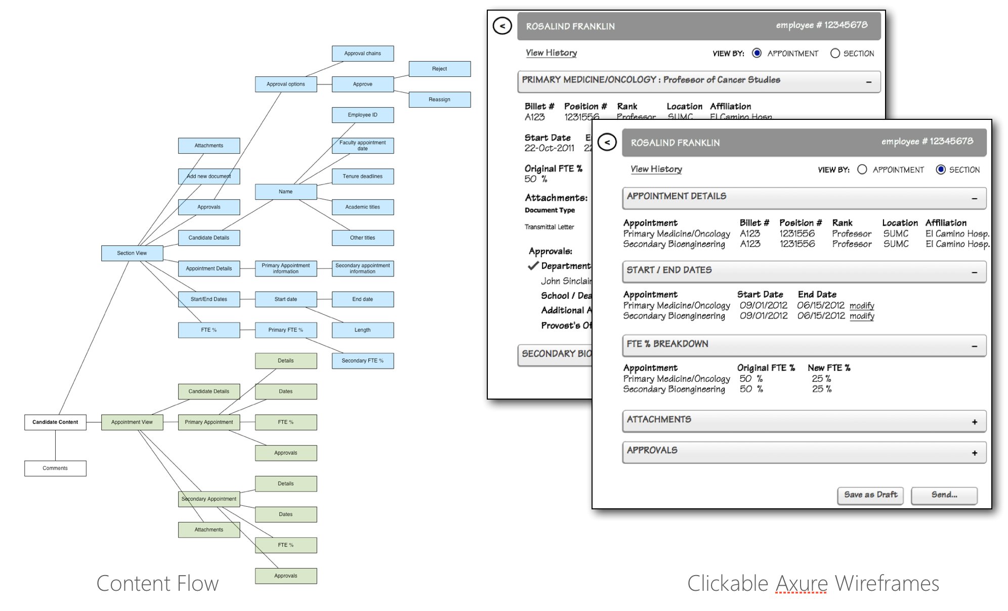
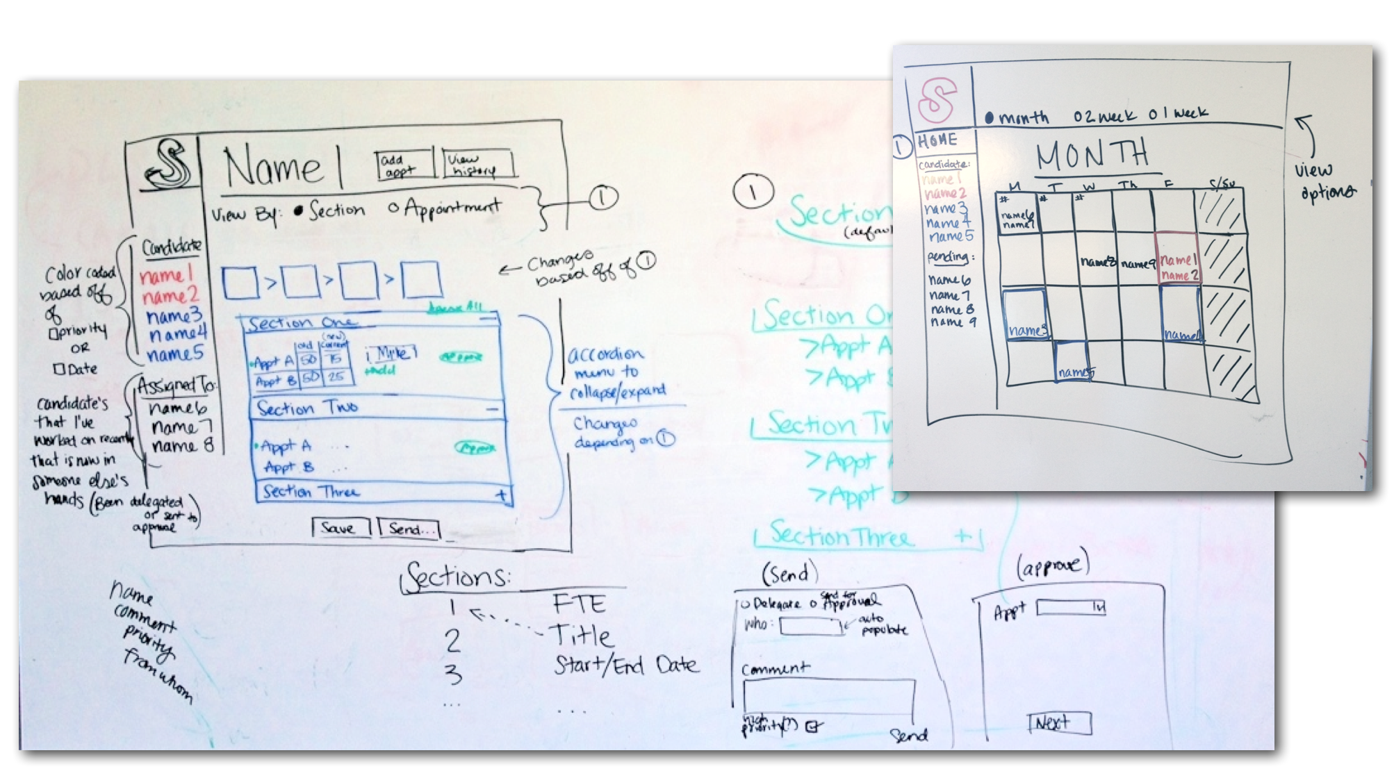
PROFESSORIAL APPOINTMENT TOOL
Stanford University needed a tool to simplify the process of professorial appointments. Traditionally, it required a tedious series of back-and-forth communications via printed forms, sticky notes and emails between administration staff and leadership to approve appointments.
The assignment was to create a seamless workflow via an online form. The solution not only created a simplified approval process, but also allowed users to collaborate on completing the needed information.
- Sitemap
- User flows
- Responsive Design Solutions
- Wireframes
- Usability Testing
- Website Design
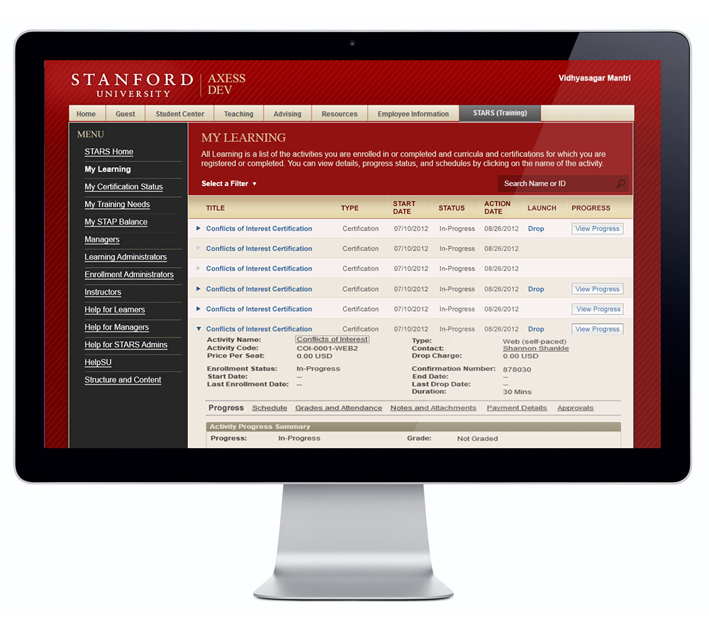
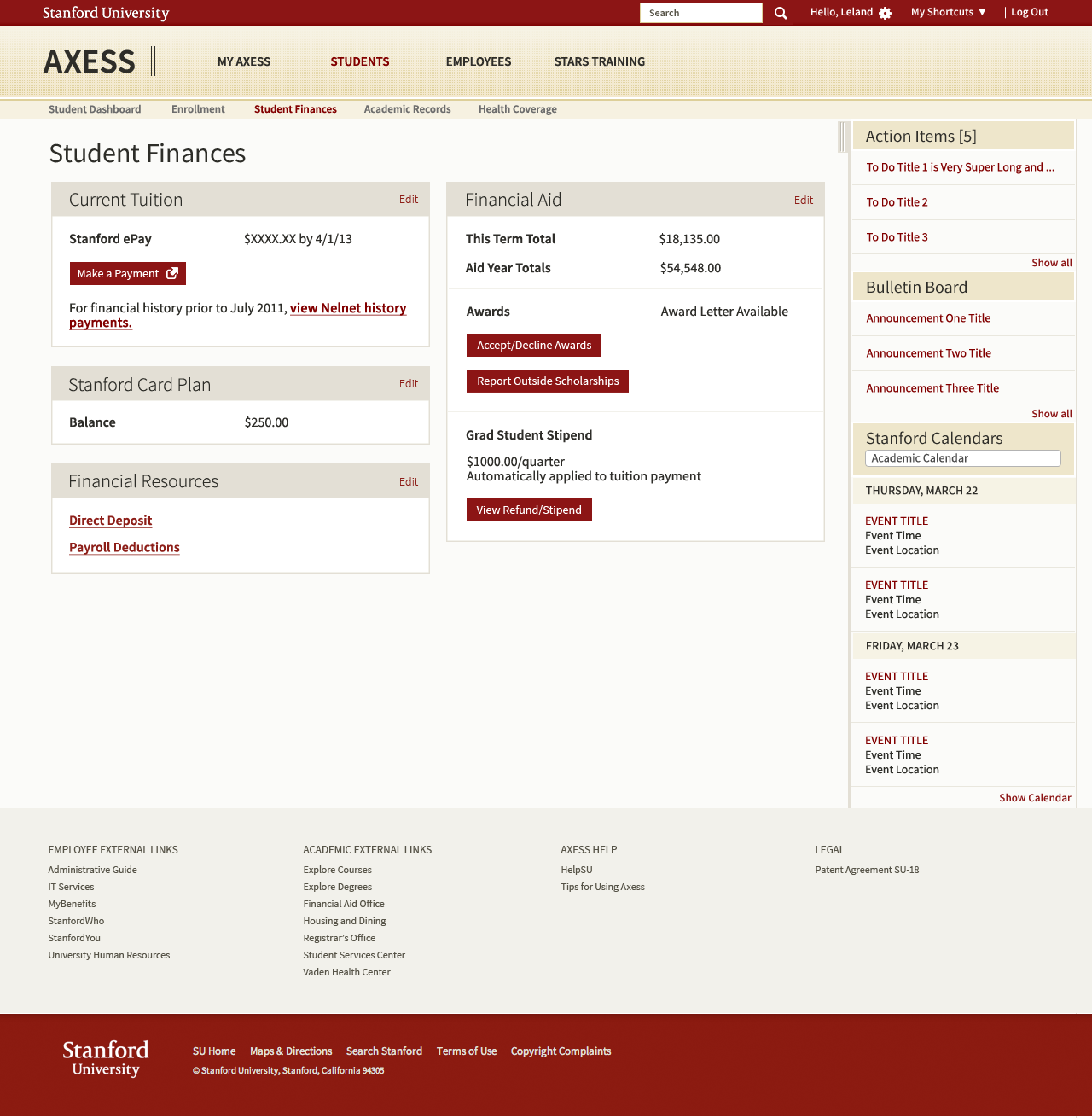
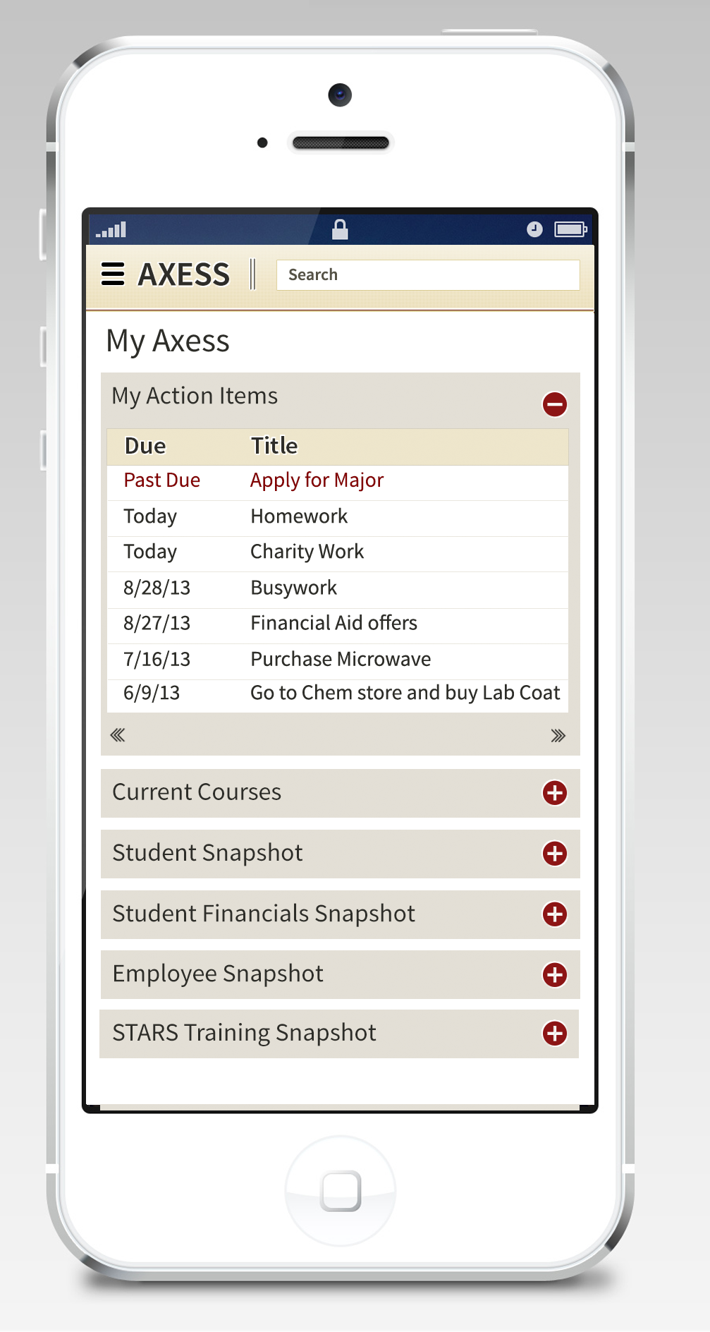
AXESS PORTAL
The following project awarded by Stanford was to re-design the central extranet portal, used by all students, staff and faculty to support access to class enrollment and schedules, self-service payments, employee and student benefits services, campus communications, etc. Tool was designed to be responsive and able to support tablets, phones and computers.
Seattle University
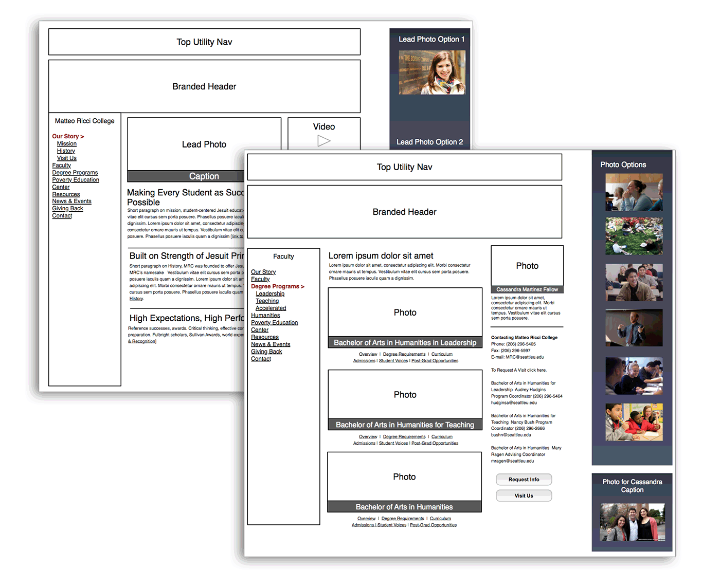
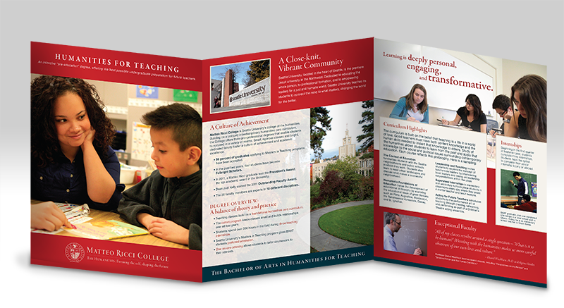
REBRANDING THE HUMANITIES SCHOOL
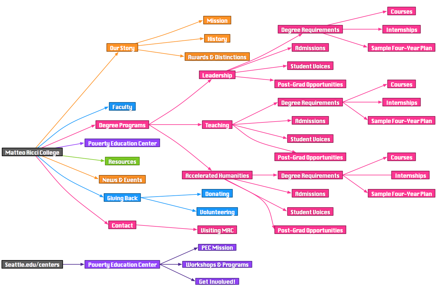
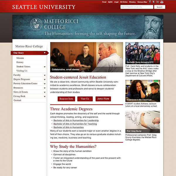
Redesign, rebrand and rework of the Matteo Ricci College, the Humanities School for Seattle University. Working with Mother of Pearl, we conducted interviews with faculty and students to determine the best brand positioning for the college. Upon presenting a re-invisioned brand strategy, we then worked with the the College Dean and SU’s Marketing Department to execute a new website and brochure collateral.
![]() View Sample Work from the project
View Sample Work from the project
The final deliverables included:
- Renaming
- Tagline
- Logo
- User Personas
- Heuristics Analysis
- Sitemap & Wireframes
- Photo Library
- Website Designs
- Brochure Designs
Washington State Employment Security Department
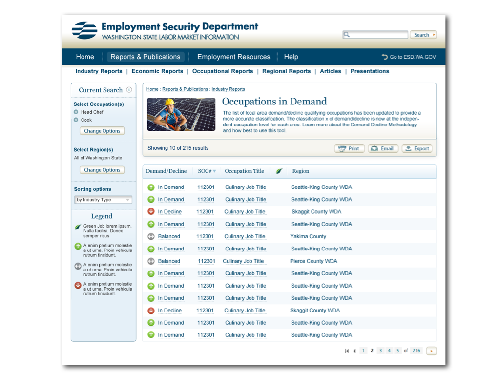
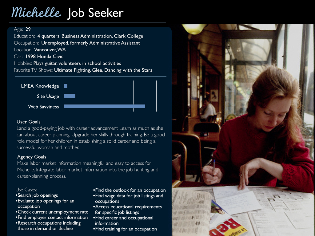

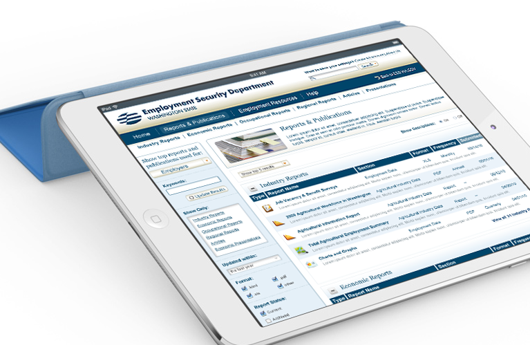
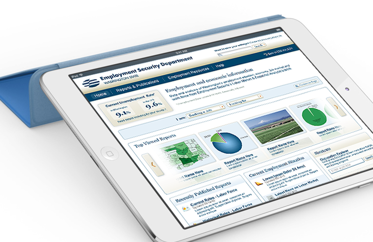
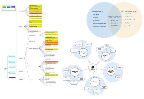
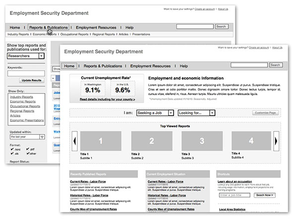
As Creative Director at Ramp Group, I was tasked to lead a complete re-architecture and redesign of the Employment Security Department‘s employment and economic information website which is set to go live in a few months. The site contains thousands of publications, reports and presentations which required a complete overhaul. The case study below describes how we accomplished this task by focusing on a persona-based, task oriented navigation structure. Usability testing showed a two-fold improvement on success rates and time to complete tasks. The ESD redesign also had won Best Government Site by eRepublic in 2012.
Deliverables I was directly involved in building included user research, content strategy, site mapping, wireframing, usability testing, interface design and heuristic analysis.
CareOregon

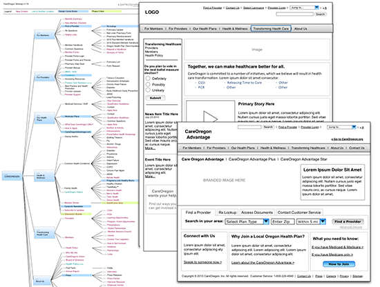
BRANDING + WEB DESIGN
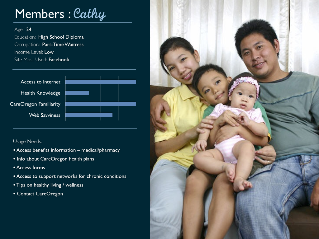
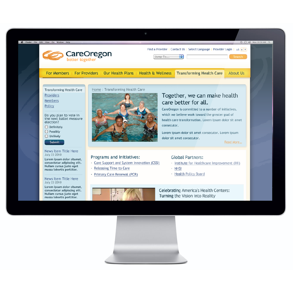
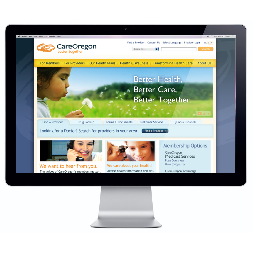
CareOregon is the largest Medicare and Medicaid provider in the state of Oregon. The redesign effort was to support a re-invisioning of the brand and the website. The process included user surveys, usability tests, creating user personas, brand exploration, editorial, photography selection, content mapping, wireframing, and design. You can view the video below to hear more about the various deliverables.
The design was targeting to improve the level of user engagement and efficiency in users reaching their intended content. The following stats were pulled for CareOregon’s new site comparing the month since the launch and the previous year’s numbers for the same time period (2/7/10 to 3/5/10 and 2/7/11 to 3/5/11):
- +34.88% improvement in new visits
- -34.44% reduction in bounce rate
- +34.18% improvement in time spent on the site
- +10.46% improvement on the number of pages viewed per user
- +38.36% improvement on visitors sourced by search engines
- +35.77% on new visitors
- .02%of users relied on search (65th most visited page was search results). Previous: 10.1% , the 9th most visited page)
Check out this SlideShare Presentation. You can hit the Play button to hear the voice over:
Inner Agency


THE SECRET SOURCE
I led this in-house design team to extend their capabilities and reach with a brand strategy devised to emote creativity. The “secret agent” motif reflected the light-hearted, casual ethos of the agency. This brand stance allowed them to extend their reach past the in-house model and into the competitive agency world with a fresh look and feel.
Trulia
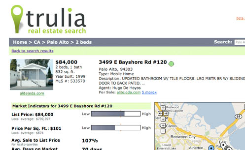
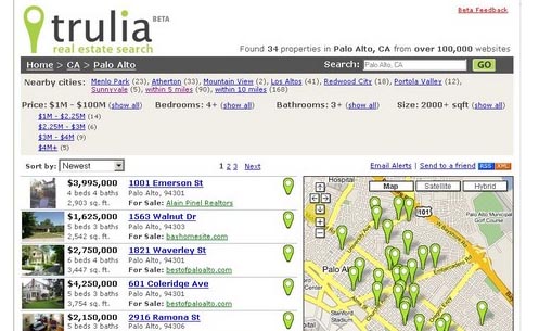

SEO HITS THE MARK
Trulia is a real estate aggregate site that combines Google Maps with search results. The User Interface needed to be built so search engines like Yahoo! And Google could spider through the entire inventory of properties. This was so effective that Trulia became the #1 real estate Google Search result immediately after launch.
The Trulia mark was designed with extensibility in mind. It is used in the map interface, as a highlighted feature of the UI and as an integral part of the identity system.
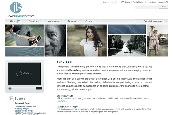
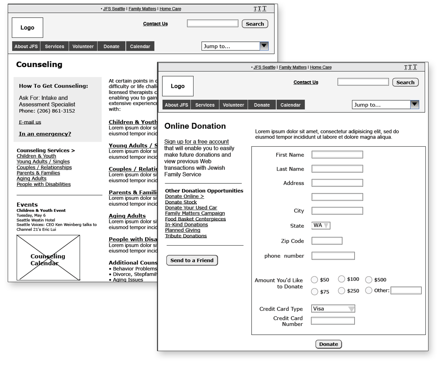
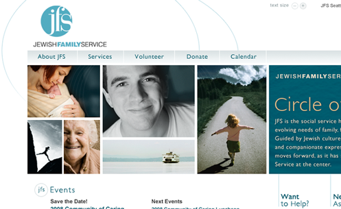
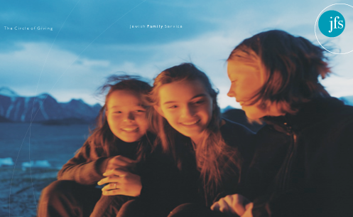
Jewish Family Service
CIRCLE OF GIVING
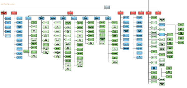
Jewish Family Service of Seattle has deep roots in the Puget Sound area with over 117 years of commitment to the community in the North West. JFS has grown from an agency that provided support to jewish immigrants to a non-profit organization that services many diverse populations in the Seattle area.
JFS’ website was not adequately presenting their mission, scope, and strategy. Our solution was to make the imagery and messaging reflect the community connections JFS support provides.
Through our collaborative efforts. JFS’s understanding of their audience. and PPMG’s expertise, within the first month of the newly designed site launch:
- Average user time spent on the site increased 81%
- The bounce rate decreased 22%
- Page views increased 54%