Print Communications
Seattle University
REBRANDING THE HUMANITIES SCHOOL
Redesign, rebrand and rework of the Matteo Ricci College, the Humanities School for Seattle University. Working with Mother of Pearl, we conducted interviews with faculty and students to determine the best brand positioning for the college. Upon presenting a re-invisioned brand strategy, we then worked with the the College Dean and SU’s Marketing Department to execute a new website and brochure collateral.
![]() View Sample Work from the project
View Sample Work from the project
The final deliverables included:
- Renaming
- Tagline
- Logo
- User Personas
- Heuristics Analysis
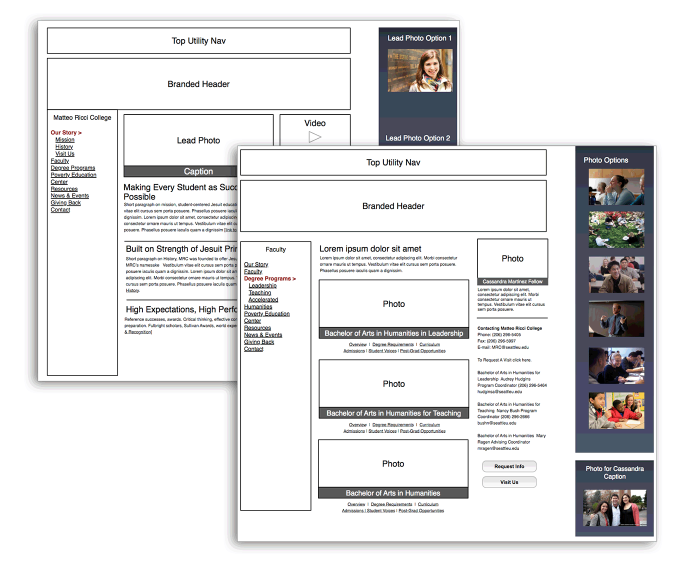
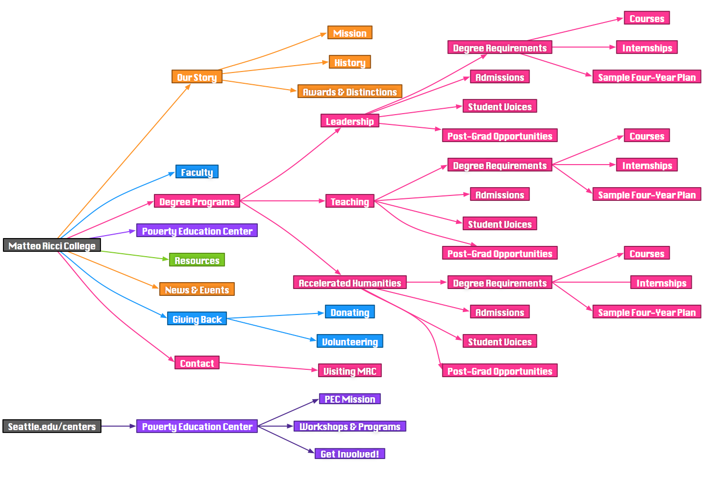
- Sitemap & Wireframes
- Photo Library
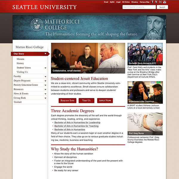
- Website Designs
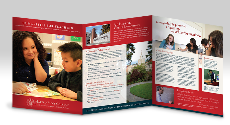
- Brochure Designs
Inner Agency
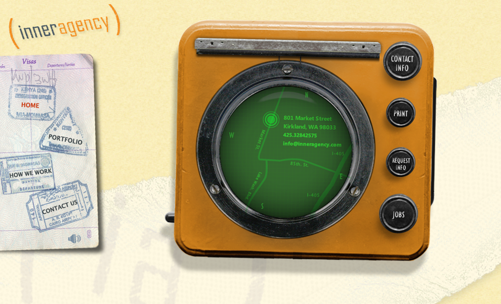
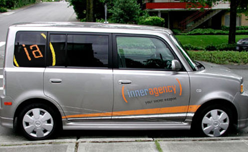
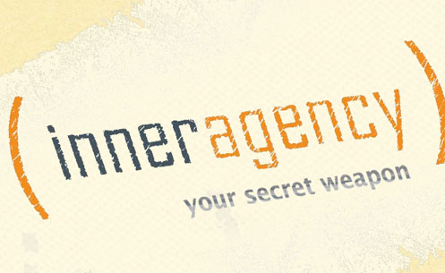
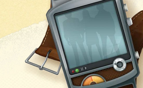
THE SECRET SOURCE
I led this in-house design team to extend their capabilities and reach with a brand strategy devised to emote creativity. The “secret agent” motif reflected the light-hearted, casual ethos of the agency. This brand stance allowed them to extend their reach past the in-house model and into the competitive agency world with a fresh look and feel.
Trulia
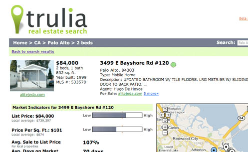
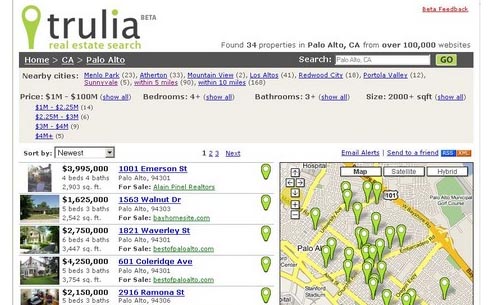

SEO HITS THE MARK
Trulia is a real estate aggregate site that combines Google Maps with search results. The User Interface needed to be built so search engines like Yahoo! And Google could spider through the entire inventory of properties. This was so effective that Trulia became the #1 real estate Google Search result immediately after launch.
The Trulia mark was designed with extensibility in mind. It is used in the map interface, as a highlighted feature of the UI and as an integral part of the identity system.
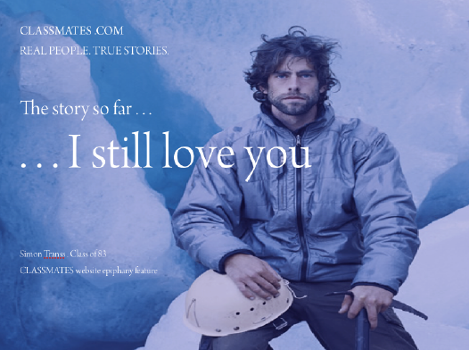
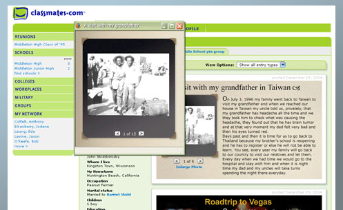
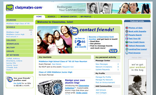
Classmates.com
BRAND SIGNIFICANCE
COMMUNITY AND NOSTALGIA
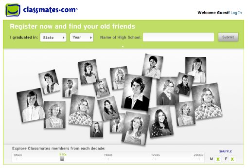
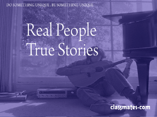
The challenge was to convey meaning to an undermined legacy brand. The solution needed to be distinguishable and resonate with its 42 million customers while not risking $70 million in user generated revenue. The new design focused strictly on school and nostalgia, while introducing a more contemporary and extensible system.
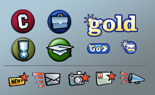
Hired in 2004 to improve the user experience and brand, I led a team of 10 to increase consumer awareness with a new, distinguishable system of interface design, information architecture, branding, promotional material, icons, buttons, and graphics. The consistent use of these graphic systems significantly increased the value and user engagement on the site, including:
- a 140% increase in registrations
- 50% increase on per-user time spent on the site
- 30% increase in user generated content
- 25% increase in conversions to paid membership
- 20% increase in opens via email click-through
American Express
EXPERIENCE PRIOR TO PPMG
INTO THE BLUE
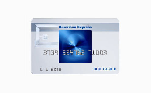
Now, American Express is one of the most respected brands in the world, but in 1998, it needed new products that would excite an upcoming generation of young professionals.
While at Siegel ↦ Gale, Jason Levine and David O’Higgins helped to elevate the American Express card design to an art form by recommending a transparent, minimalist design that was stylistically in tune with the aesthetics of the target audience. It brought the brand into the 21st century by incorporating innovative security technologies and account management options with a smart chip.
Amex Blue from American Express was a dramatic example of design innovation and a clear departure from other cards. Its design and functionality created an iconic brand. First year application rates were up 20-30% above expectations.