Analysis
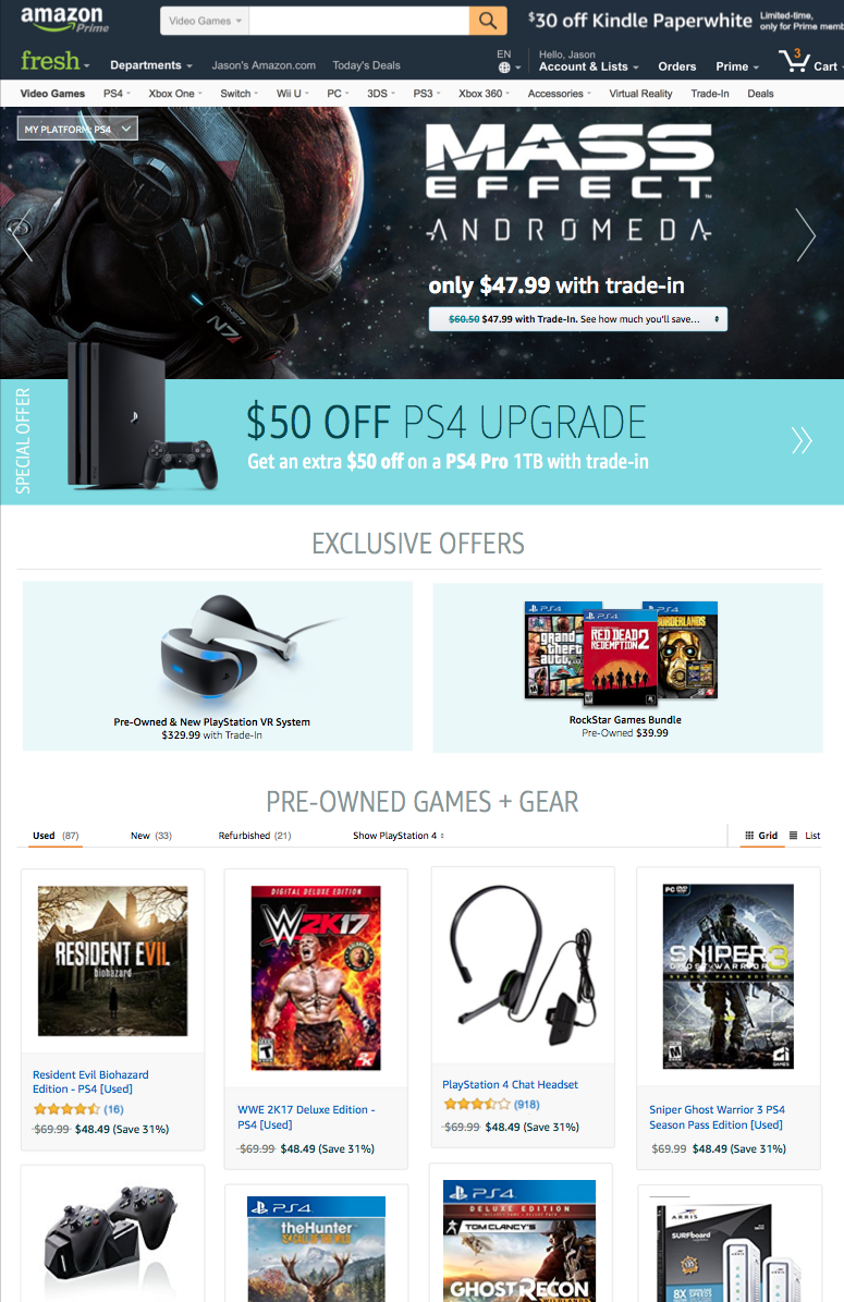
Amazon
UX LEAD FOR AMAZON TRADE-IN, AMAZON RENTALS, WAREHOUSE DEALS, AND LIQUIDATIONS
Since March 2014, I have been the UX lead for oversight of all branding, user experience, user research and visual design for four Amazon global sub-brands, totaling +$800M GMS. As a key stakeholder in all product planning and development, my role is to lead the UX strategy, team management, resource planning and oversight of all design deliverables for all customer-facing efforts on desktop.
As the UX Lead, I am responsible for knowledge management, managing work queues, crafting and pitching design strategies, driving alignment around design and product decisions, development of other designers, and partnering with peers, stakeholders, and owners across Amazon.
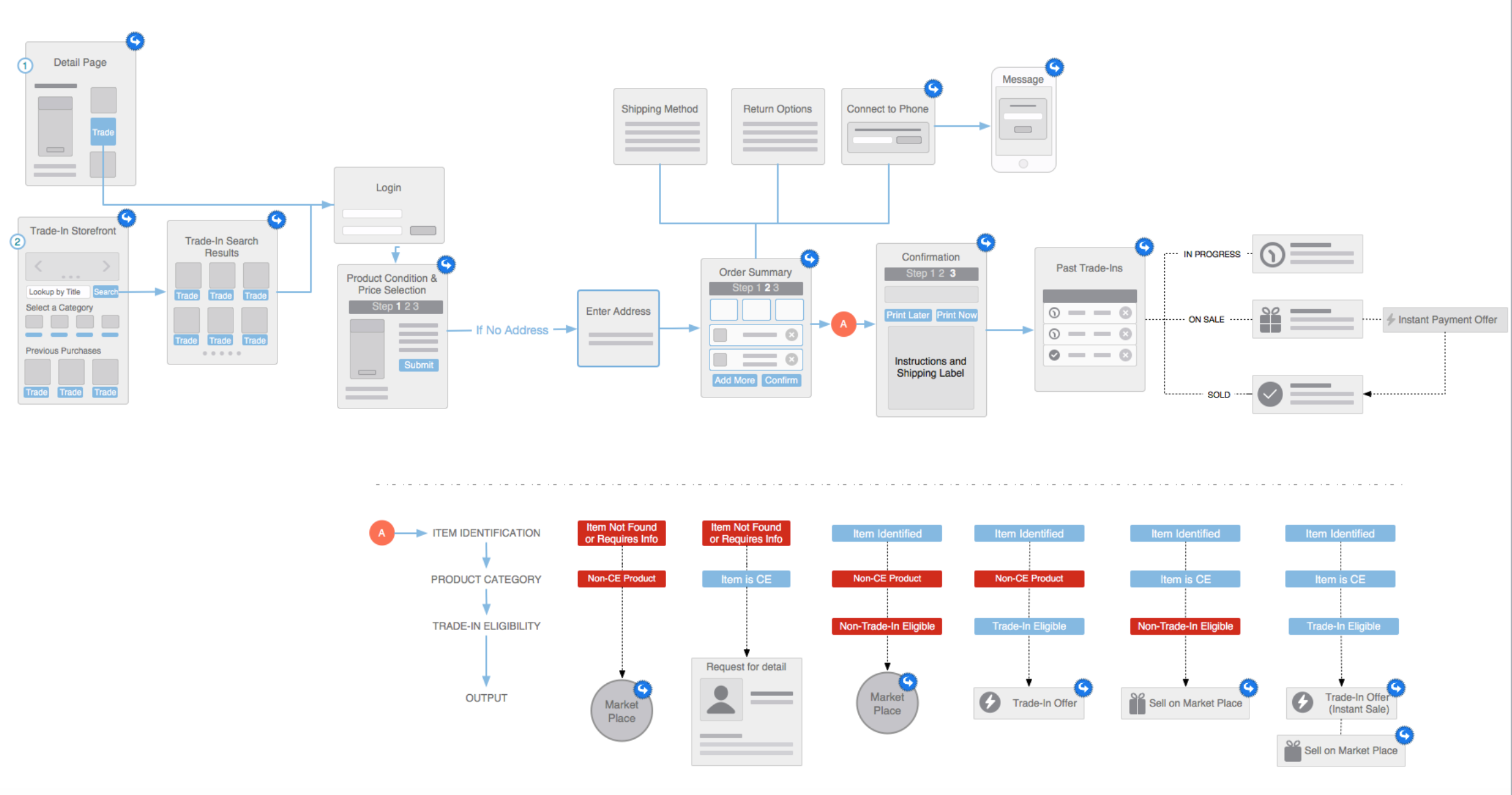
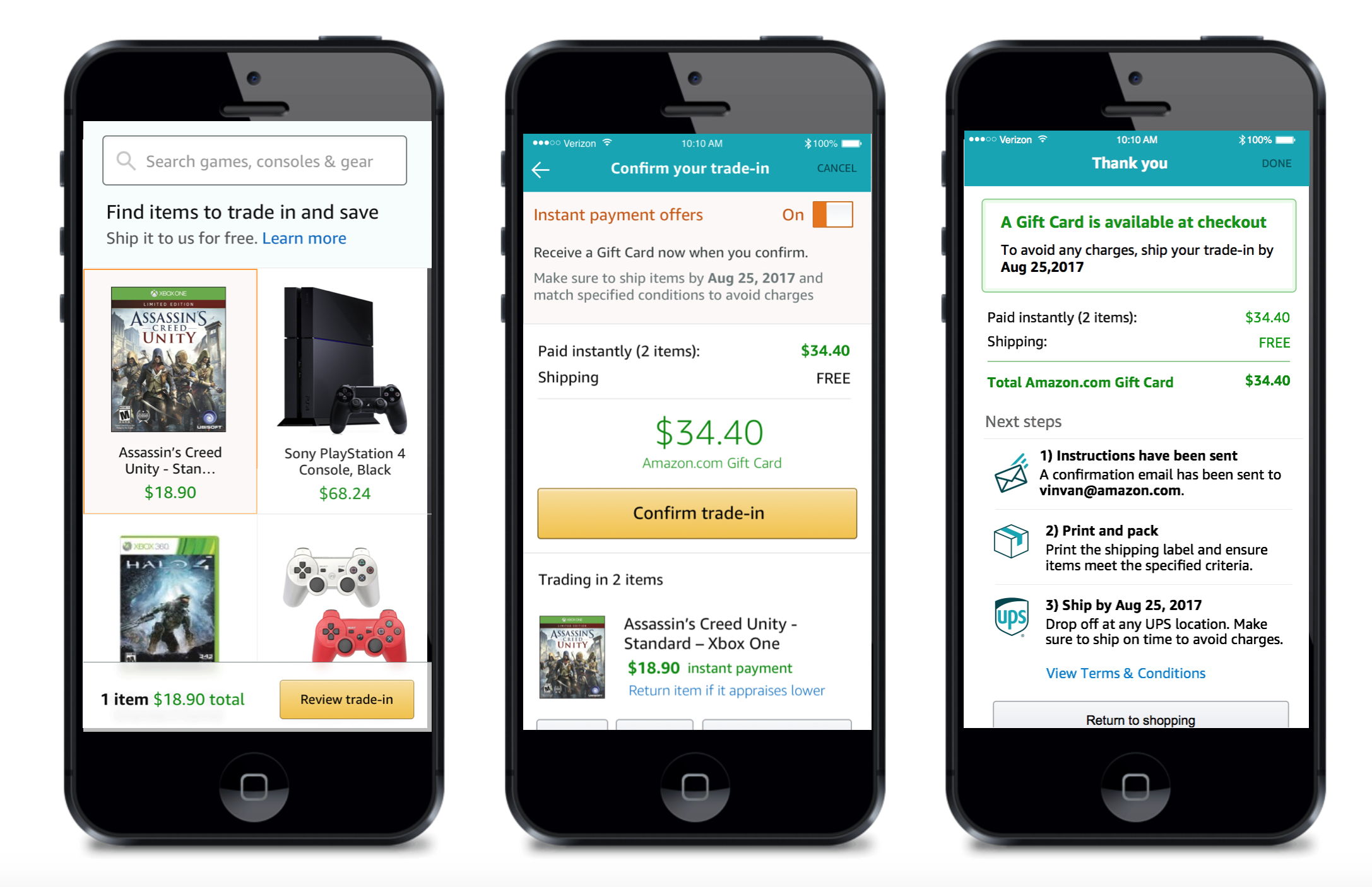
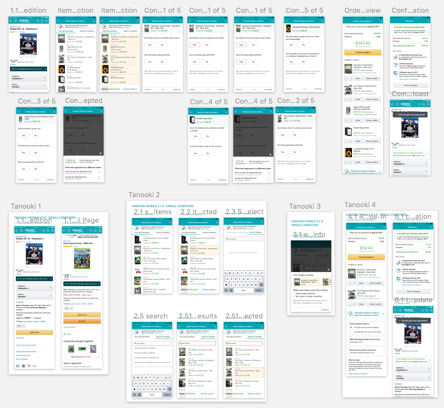
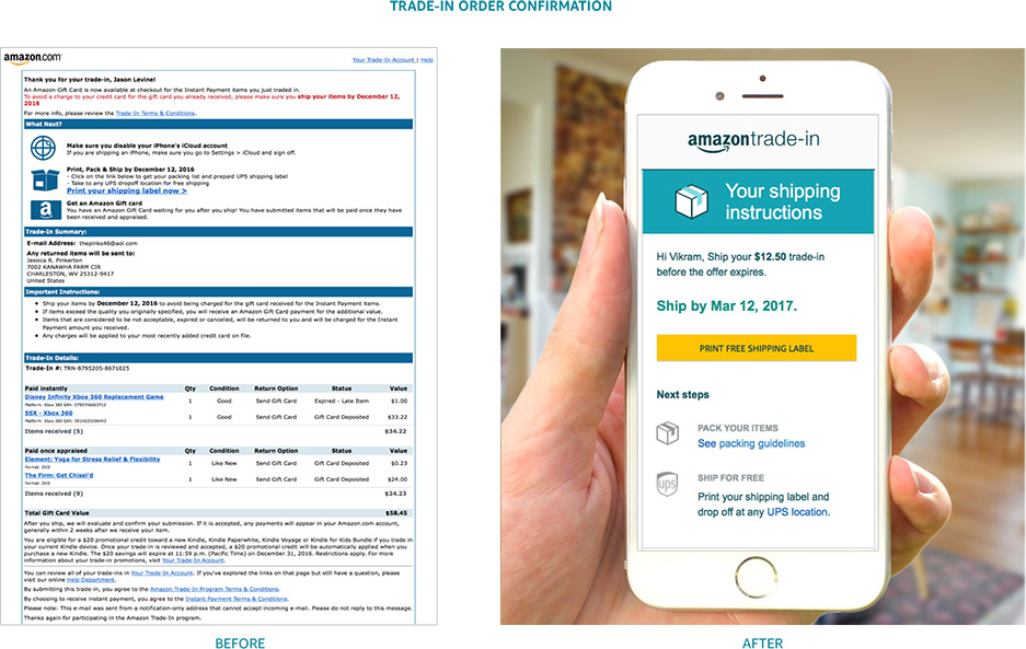
- Trade-In increased revenue +50%, increased submission by over 300%, grew customer base over 60%, and improved retention 15%
- Rentals market share grew 160%, and average basket per customer size by over 70% Warehouse Deals processing facilities saved $2M per year from design improvements
- Filed a pending patent March 201
Stanford University
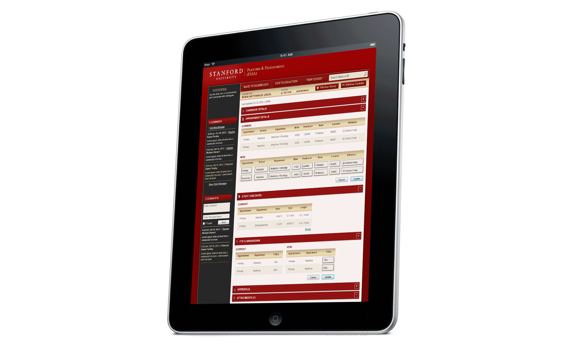
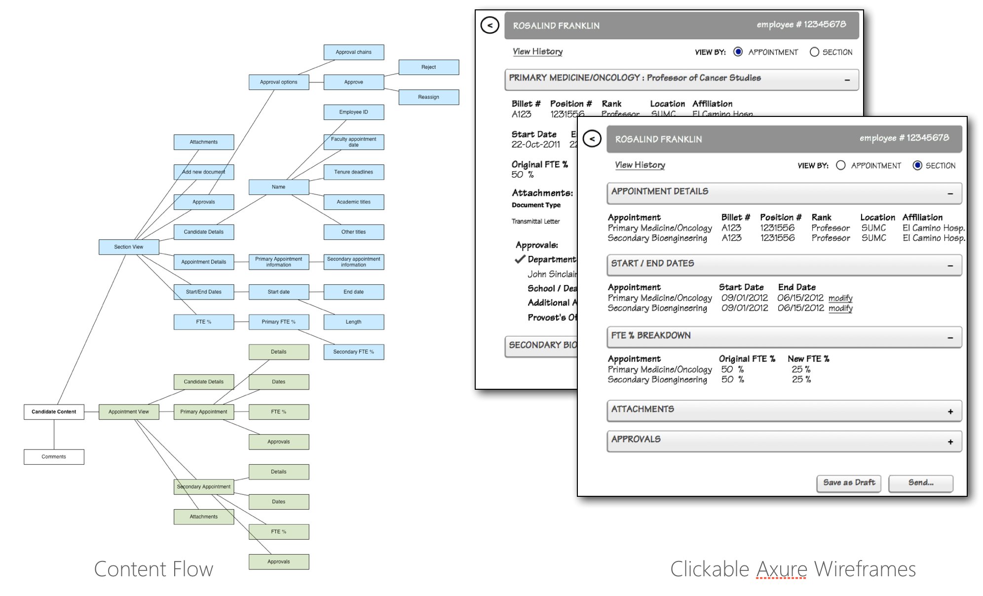
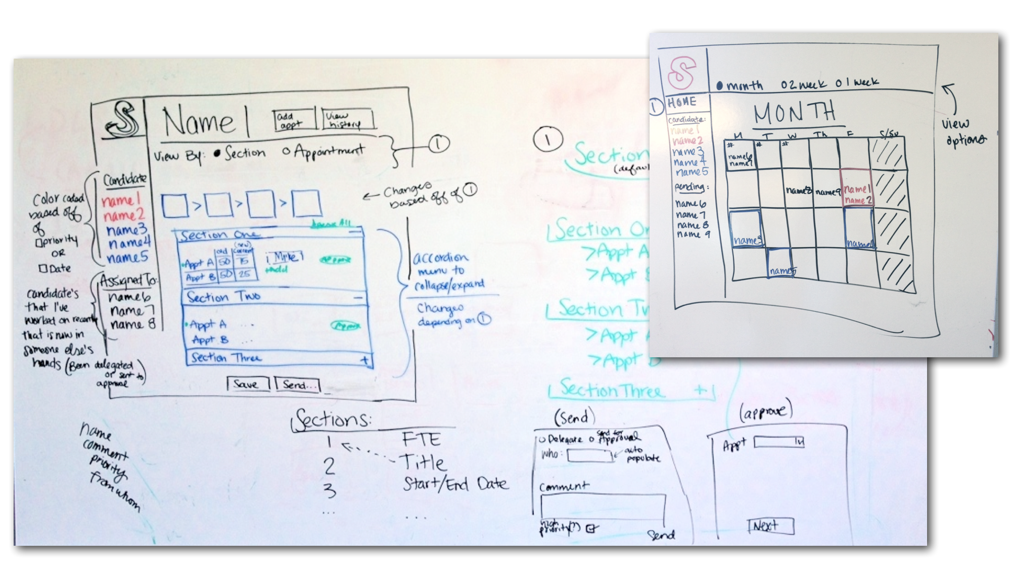
PROFESSORIAL APPOINTMENT TOOL
Stanford University needed a tool to simplify the process of professorial appointments. Traditionally, it required a tedious series of back-and-forth communications via printed forms, sticky notes and emails between administration staff and leadership to approve appointments.
The assignment was to create a seamless workflow via an online form. The solution not only created a simplified approval process, but also allowed users to collaborate on completing the needed information.
- Sitemap
- User flows
- Responsive Design Solutions
- Wireframes
- Usability Testing
- Website Design
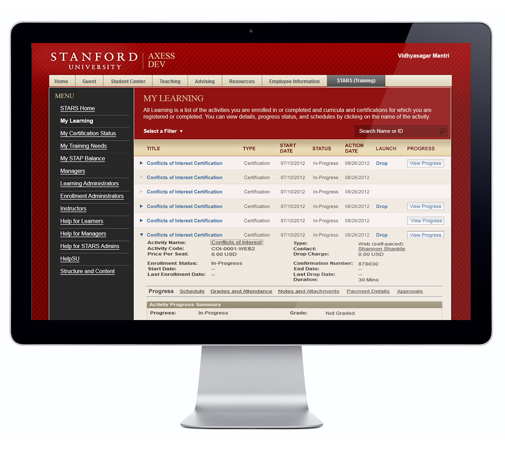
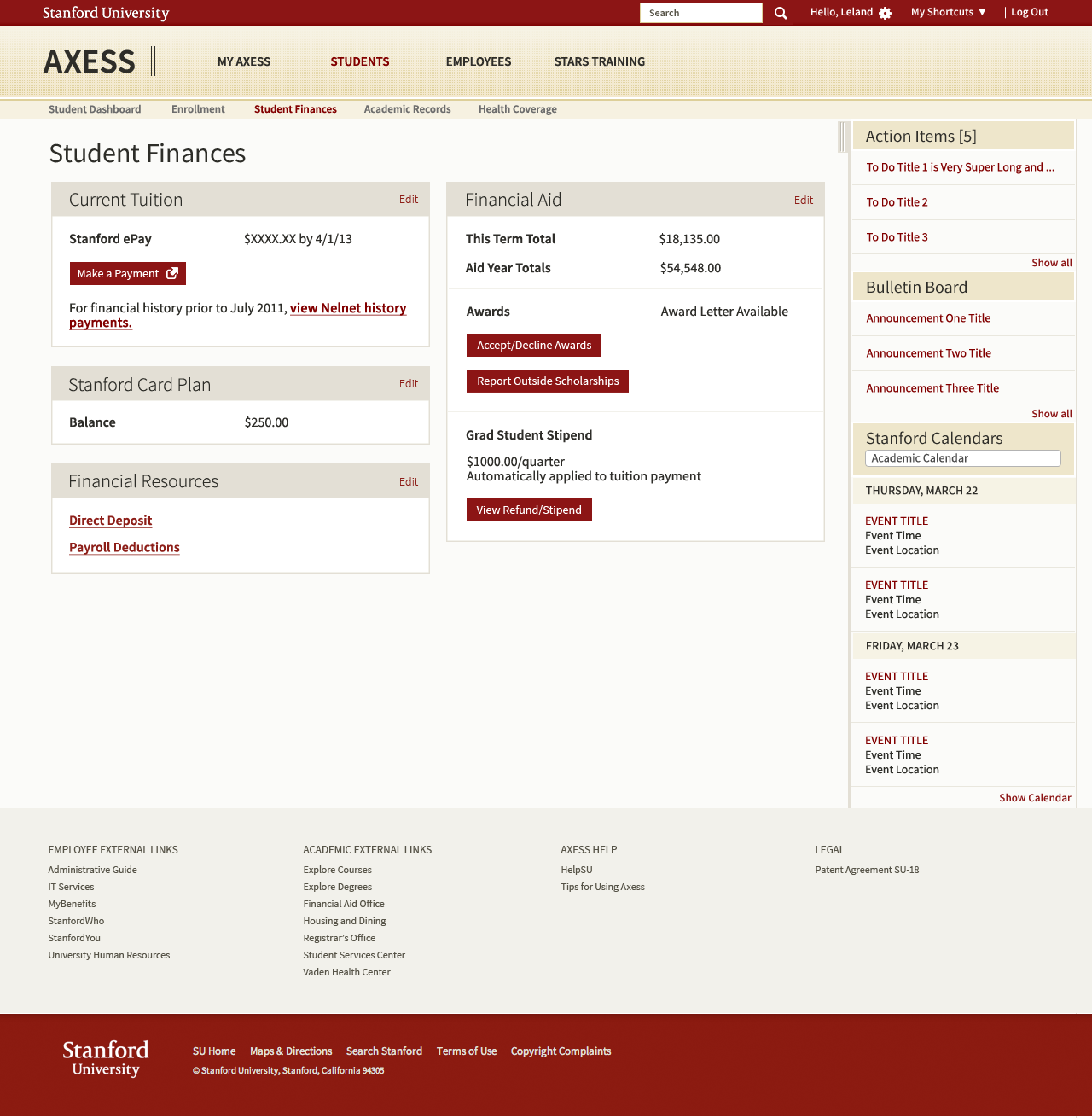
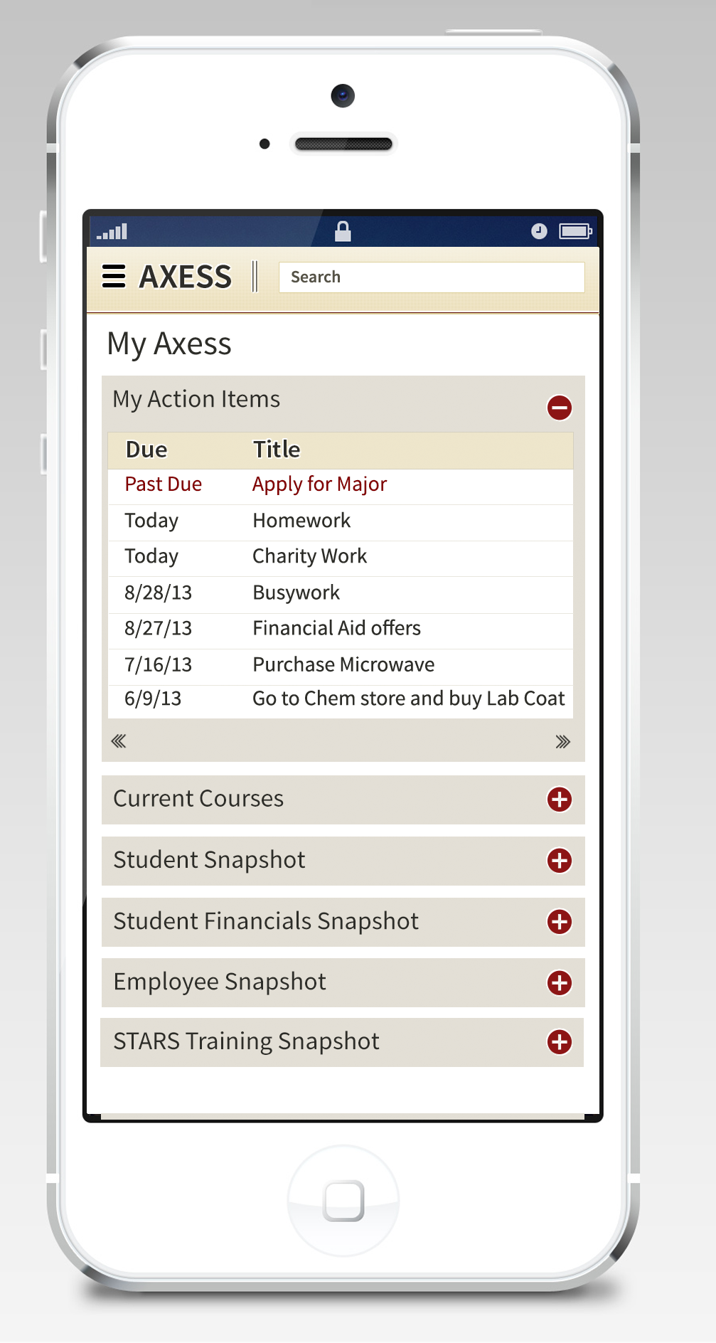
AXESS PORTAL
The following project awarded by Stanford was to re-design the central extranet portal, used by all students, staff and faculty to support access to class enrollment and schedules, self-service payments, employee and student benefits services, campus communications, etc. Tool was designed to be responsive and able to support tablets, phones and computers.
Seattle University
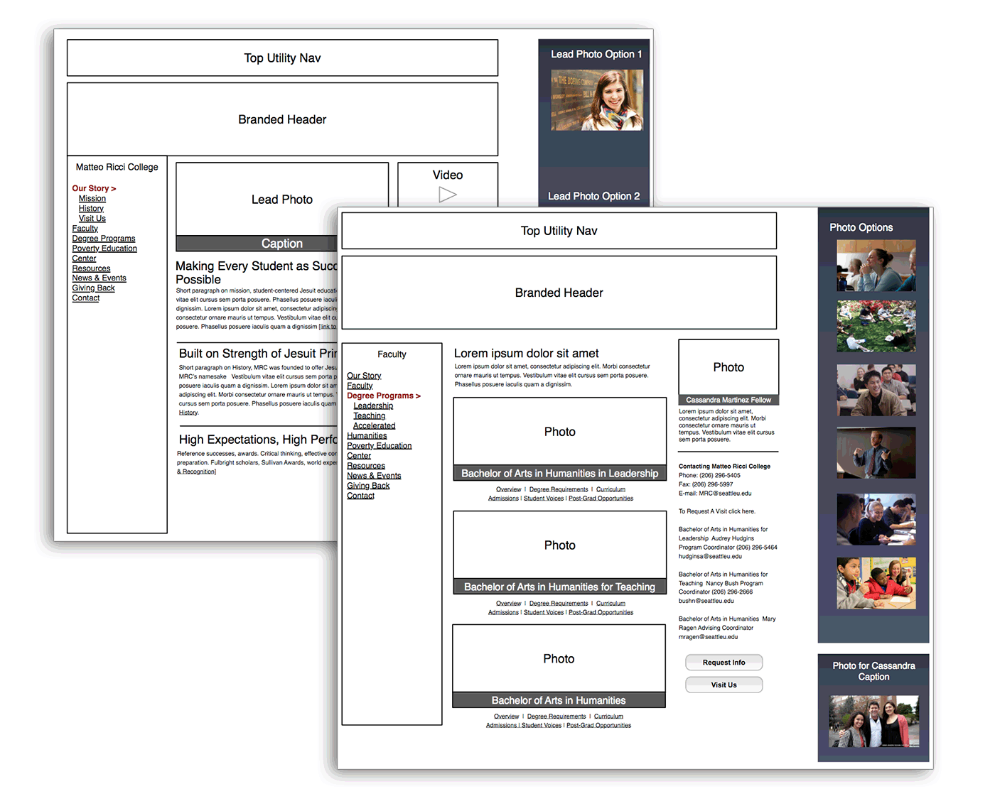
REBRANDING THE HUMANITIES SCHOOL
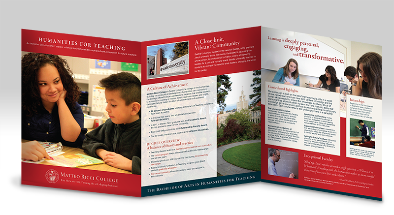
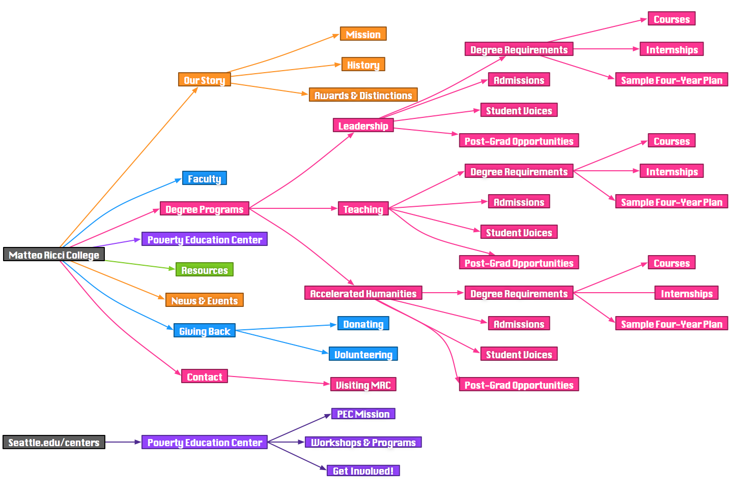
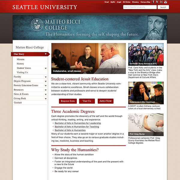
Redesign, rebrand and rework of the Matteo Ricci College, the Humanities School for Seattle University. Working with Mother of Pearl, we conducted interviews with faculty and students to determine the best brand positioning for the college. Upon presenting a re-invisioned brand strategy, we then worked with the the College Dean and SU’s Marketing Department to execute a new website and brochure collateral.
![]() View Sample Work from the project
View Sample Work from the project
The final deliverables included:
- Renaming
- Tagline
- Logo
- User Personas
- Heuristics Analysis
- Sitemap & Wireframes
- Photo Library
- Website Designs
- Brochure Designs
Washington State Employment Security Department
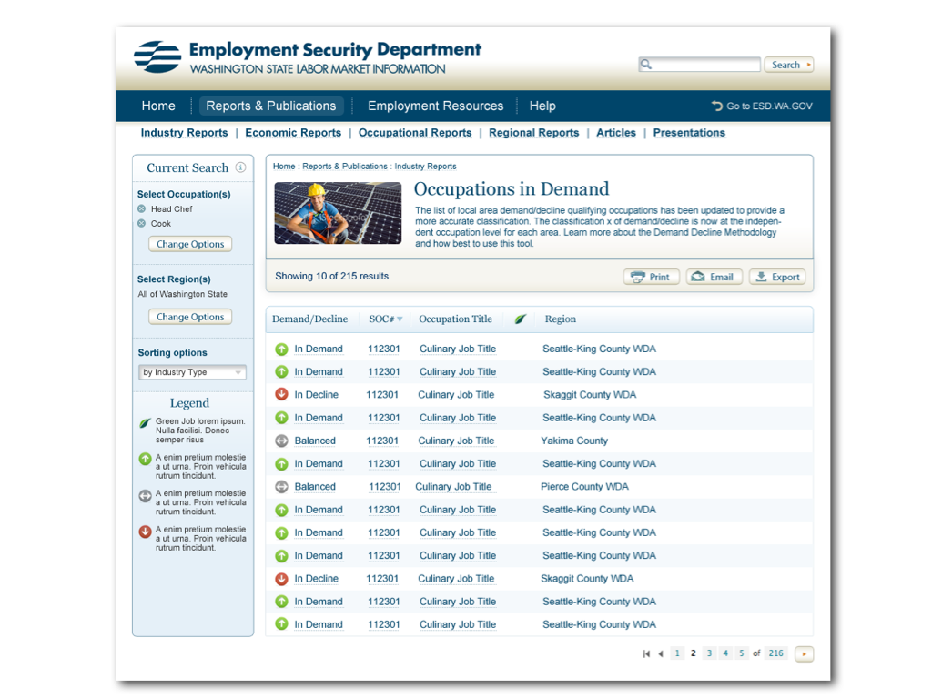
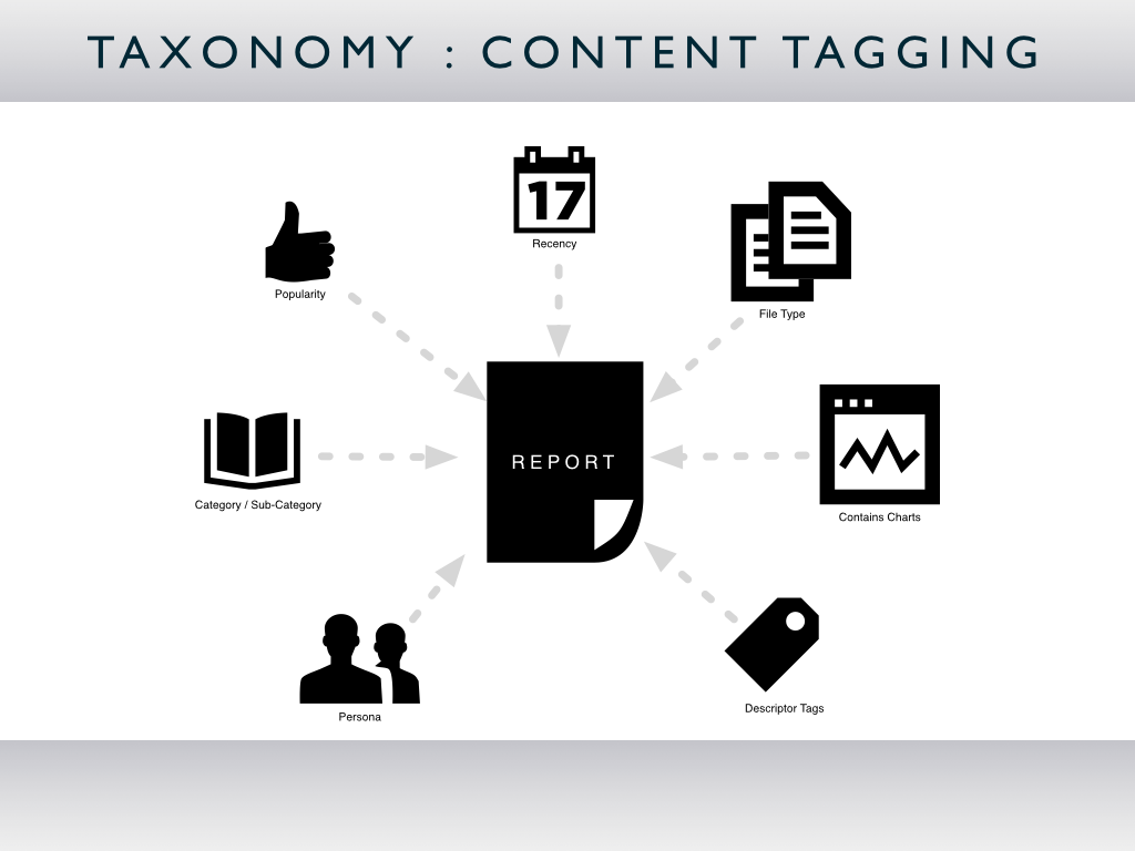
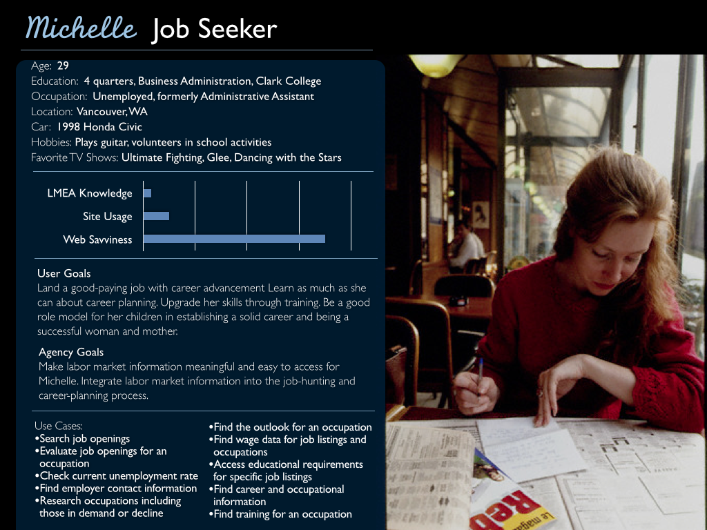

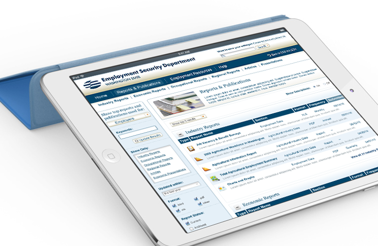
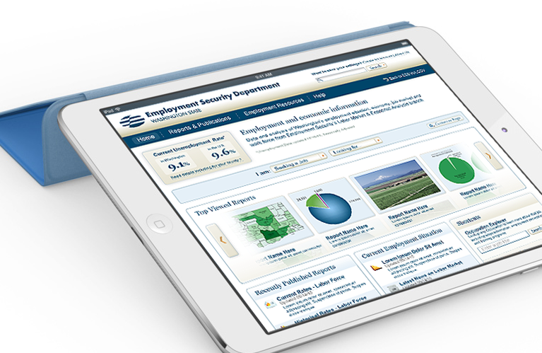
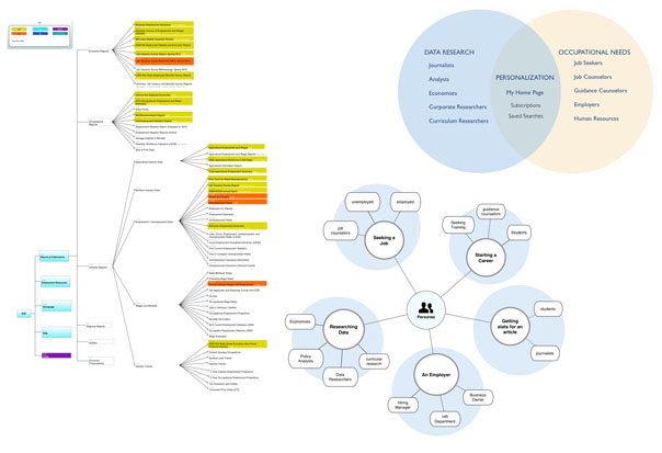
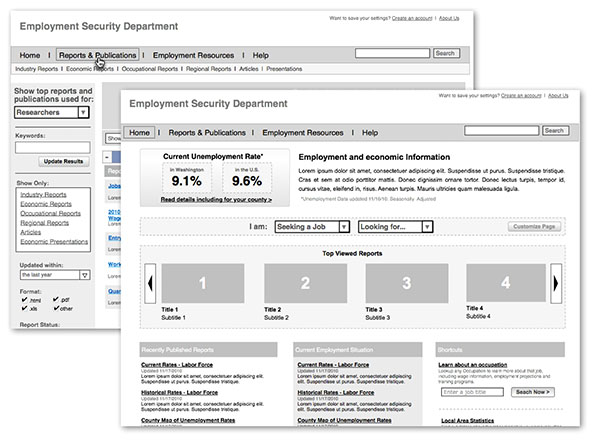
As Creative Director at Ramp Group, I was tasked to lead a complete re-architecture and redesign of the Employment Security Department‘s employment and economic information website which is set to go live in a few months. The site contains thousands of publications, reports and presentations which required a complete overhaul. The case study below describes how we accomplished this task by focusing on a persona-based, task oriented navigation structure. Usability testing showed a two-fold improvement on success rates and time to complete tasks. The ESD redesign also had won Best Government Site by eRepublic in 2012.
Deliverables I was directly involved in building included user research, content strategy, site mapping, wireframing, usability testing, interface design and heuristic analysis.
Sealaska
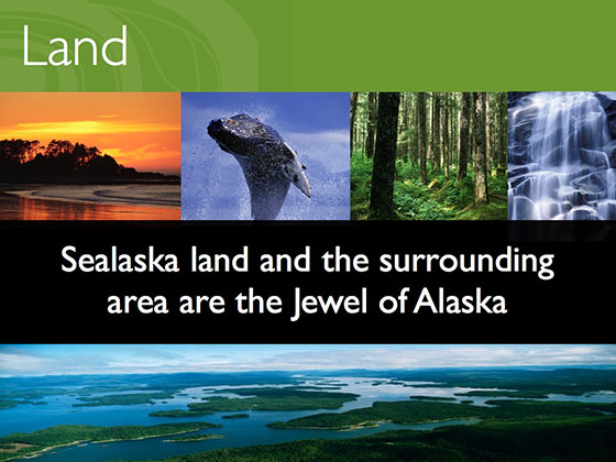
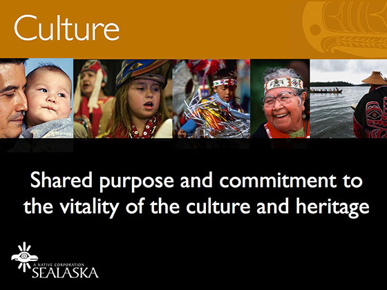
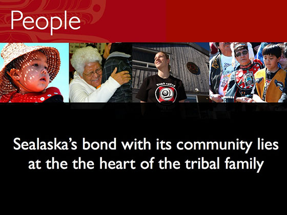
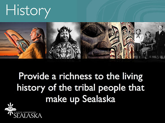
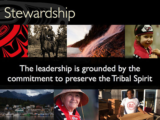
Sealaska is the largest Native American land corporation in Alaska, supporting the three local tribal groups of the area. Sealaska’s challenges, in many ways, are not unique- preserving a cultural significance to your heritage while looking to grow and be relevant. What they needed was a brand strategy to communicate their vision. Teaming with Doris Quan of Mother of Pearl, we introduced a brand and direction to re-imagine their vision as a central force for sustaining a vibrant tribal culture within their community.
Deliverables included:
- Heuristics Analysis
- Competitive Audit
- User Personas
- Brand and Content Strategy
- Photo Selection and Guidelines
Inner Agency

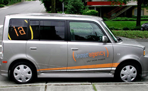

THE SECRET SOURCE
I led this in-house design team to extend their capabilities and reach with a brand strategy devised to emote creativity. The “secret agent” motif reflected the light-hearted, casual ethos of the agency. This brand stance allowed them to extend their reach past the in-house model and into the competitive agency world with a fresh look and feel.
Virgin Travel Group
BRAND SIGNIFICANCE
AUDIENCE LOYALTY
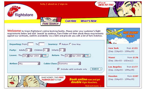
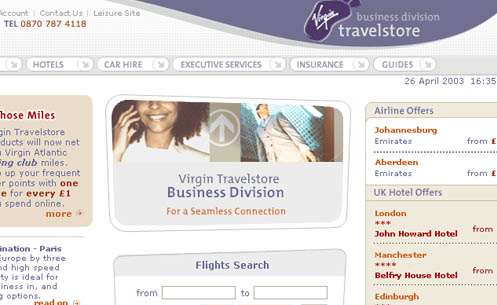
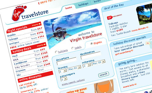
As Creative Director for Virgin’s Travel Group from 2002 to 2004 in the UK, I was tasked to lead a team of web developers, writers and designers. Virgin Travelstore’s core audience is loyal to the Virgin brand and expects Virgin’s core values to be represented. All aspects of Virgin Travelstore were overhauled to emphasize value, ease-of-use, and edginess. Virgin Travelstore tripled its monthly sales by increasing the opportunities for cross-selling and reducing the steps required to purchase.
Many advanced features were built into the various interfaces of Virgin Travelstore’s sections. All functionality, production, design, and production decisions were based on business needs. The Flights section functionality and layout were designed to streamline the searching and selecting process. The Holidays section was designed to provide resort information to support the user’s sale decision.
Virgin Travelstore’s sales increased three-fold and went from 10th in the UK to 5th top online travel site.
Toyota

COROLLA SOCIAL DRIVER CAMPAIGN
FUN AND PLAYFUL
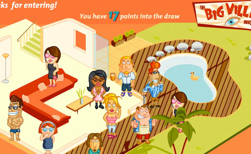
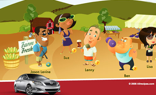
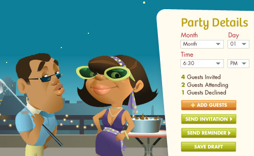
In support of Toyota Corolla’s Social Driver Campaign, I led an effort for a co-branding project contracted by All Recipes to create a kicky party planner and sweepstakes mini-website. As Creative Director for Perfect Pixels, we provided information architecture, design, illustration, and development for the initial launch and 3 subsequent site refreshes.
We successfully tied Toyota Corolla’s print ad campaign with the online experience and gave their representing agency an excellent resell opportunity with the Flash party-planner application. The robust experience included many online-community functionalities such as: blogging, sharing to mobile phone, automated sweepstakes entries, photo-sharing, and user-generated content.
Township 110
TOWNSHIP 110 BRANDING
TREASURING NATURE
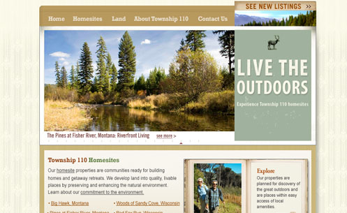
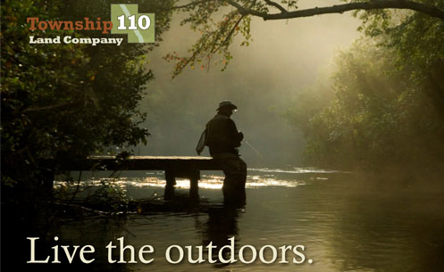

Township110 offers exurban retirement/second home living in rural areas throughout the United States. Perfect Pixels worked closely with the company’s executive team to create a logo and tagline that reflected Township110’s integrity and environmental policies.
The tagline speaks to the outdoor enthusiast on a visceral level. The intention as to create a tagline that’s tone could apply to various demographics.
This site needed to speak to the target audience and showcase multiple land developments while furthering the brand. Perfect Pixels chose to incorporate Flash animation elements to immediately introduce the user to the beauty of the homesites with an image rotator and a flipbook. This site gives the user an overview of Township110’s land offerings and gives them the option to research further by going to the specific development itself, or to a featured homesite.
Snap Village
BRAND SIGNIFICANCE GET FRESH
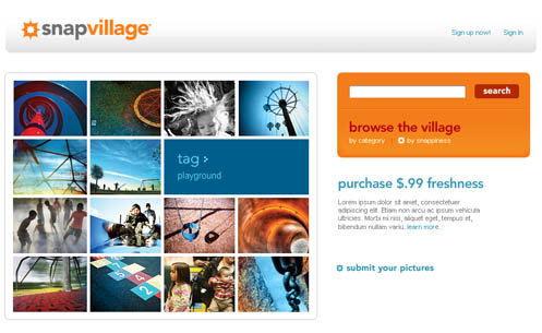
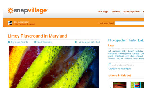
Corbis entered into the Web 2.0 space with its SnapVillage brand. Working in conjunction with another agency, PPMG created the distinctive mark that speaks directly to the core audience, photography enthusiasts. The logotype and colors were selected to provide the punch that Corbis was looking for in the brand. We used warm colors and high contrast along with a sophisticated use of white space to fulfill the brand ethos – freshness and pop.
We also consulted and provided strategic direction for interface design, user flow and information architecture.